Thursday, August 15, 2013

Everyday Design Part I

Design doesn't just include technological design, but also includes things like food. Today, I want to share with you guys my thoughts on food packaging design and evaluate it based on its aesthetics and utilitarian value. I will be trying to do this through a random Google image search so that I can be a bit more unbiased in my evaluation of food products.
This one I like - it's apparently a design for a brand of "Zipp smoothie" Like most modern design, this one stays true to the limited color combination (there are only three main colors in any of the three design) which allows this to be a very seamless design. With the emphasis on the lighter variety of these respective colors (the red isn't deep red and the green is a light green) allows for a very "light" feel. Perhaps I find most interesting about this design is the concept of a zipper on the bottle. This has two implications - that drinking this "healthy" product will allow a consumer to reduce his/her weight in such a way that they will be able to zip up a tight-fitting jacket for example. However, I dislike the incredibly small font used by these bottles - they are too small to be entirely practical. Even still, the giant fruits does still give some indication of what the contents are like. Otherwise, the bottle, is well a bottle and it serves its function just fine. The design is mostly good, but only because of the concept. Otherwise, any other design are merely forced abstract portrayal of the product information. In short, sticking a triangle and writing on it "smoothie" is convenient, but not very aesthetically different. In a world full of competition, this is not a good thing.
As opposed the previous one, this one is extremely effective at conveying what is inside the bottle; preferring to utilize the color of its contents to provide the background of the sides of the container. These are the perfect example of utilitarian design which allows important information such as ingredients to be displayed on the front side of the product. This is good, as it condenses two important consumer information when it comes down to food (what is it and what is it made of) The colors also help deliver stylistic differentiation but still maintaining the three color rule to provide for a pleasant experience (the yellow font on the lemonade on the left is an example of color choice) 

In short, these two images display widely different approaches to design. I would like to call the first style as an artistic interpretation of design - the incorporation of symbolic ideas to create a concept to market. The second one I would like to think of as an very utilitarian response to design, pursuing function over design, but adding design principles to make it appealing to the consumer. I think both of these forms excel at the same thing, but in different ways.

Designed by Apple in California Video Analysis


Earlier in my previous post, I examined the kind of designs that I enjoyed where I talked about consumer design and I mentioned the iPad mini as one of those design that I felt quite encapsulates the trends for the early 21st century. But not only that, I would like to extrapolate this by examining how this relates to Apple's Design thought. To do this, I will refer to the infamous Designed by Apple in California video which explains many of Apple's design theory and how it relates to the iPad mini. But it doesn't just reflect on Apple's design, it is also reflected upon it marketing philosophy.


The video overall has this very simple black and white theme which is immediately reflected with the design of all of Apple's products except for the iPod line and older macs. In fact, Apple's own website is largely gray and white, with hints of black. This is not just a common theme for Apple products, but is is also a common color combination for modernist design in general; a three/two color complimentary combination often allows for a clear, non cluttered layout. The message of the video speaks to design as invoking emotions with consumers. This phenomenon is true with color, shape and construction having the biggest impact on creating joy for consumers with an Apple product. The colors - black and white is a very classy combination and the white version of Apple products are often coveted because they give this immaculate, delicate appearance to it. Knowing that its products are often monochromatic, Apple's marketing and design involves two other important elements that makes Apple very successful. Their ads and info pages often depict people smiling while using their products and at the same time using very colorful themes within the iOS operating system itself, allowing Apple to emphasize the actual user experience, rather than the product design. Apple is also popularizes the simple market method; using concise buzz words like "Retina" and bold claims like "the World's most advanced mobile operating system" to give consumers the low down on their products. This often allows Apple to captivate its consumers quickly and allow them to spread the word more quickly. Apple's video also maintained that "for a thousand no, there is one yes" as a fancy way of saying that there were many drafts and revisions before there was even a prototype. This doesn't make Apple any way unique; like its marketing buzz words, this is another example of Apple's stylistic marketing. Looking into the future of Apple, their iOS 7 operating system emphasizes the bright user experience and simplistic approach into design, reinforcing Apple's design ethos of hardware as being "sleek" and user experience "productive and colorful". However, I will review iOS 7 in the future and give a more in depth look at the creation of Apple Vice Design Chief, Jony Ive.

Friday, August 9, 2013

Personal Interest in Design Part III: Types of Design I Like

This is a continuation of my previous post which articulates the different kinds of design I like. In this post, I will focus on Consumer electronics design, which has always been a strong field for design, as consumers in the present day where good design can sell. In this post, I will showcase different products and I will attempt to articulate why I like these designs.

1. iPad Mini
I personally find the iPad mini much more attractive than the standard 10 inch iPad. For instance, this iPad comes with very little bezel around its screen and it comes with a beautiful aluminum unibody chassis. This comes together in a very attractive and slim package that will function very well as an ultra portable tablet. However, I must point out the several practical flaws of the iPad mini. First of all, the aluminum chassis makes the iPad mini extremely slippery; holding it doesn't feel secure - it does not provide enough of a grip especially as the tablet uses an unconventional 4:3 aspect ratio, giving a slight disadvantage to people with smaller hands. Speaking of the 4:3 ratio, oftentimes movies and media files in widescreen format oftentimes induce black bars on the iPad, thus eliminating some of the benefits of utilizing the extra screen estate. Even still, the iPad mini is fulfills its intended purpose just fine and offers great aesthetics on top of it. These two key elements work to create a "good" design.

The iPad mini and Apple products in general encapsulate many of the modern aesthetic sense; simple, clean and monochromatic colors help establish elegance and functionality. To this end, Apple is often considered as one of the tech industry's best designers, having started this trend towards what I coin "beautiful simplicity".

2. Corsair Vengeance K70 & K95 mechanical keyboard
These keyboards represents a good fusion between design and functionality. First, from an functional perspective, these are also some of the better keyboards on the market. These keyboards are mechanical keyboards which mean they utilize actual physical switches to register key presses rather than using electrical impulses to transmit this information. This has two huge advantages; first of all, these keyboards doesn't require a-lot of actuation force in order to register key presses. These keyboards utilize the Cherry MX Red switches, which means they require low actuation force but have less tacile feedback. Even so, typing on these keyboards feel far more satisfying than membrane style keyboards because of the satisfying experience of bottoming out on these keyboards - I can feel some of the key presses on these keyboards due to this. Another advantage is the sheer lifespan of these keyboards; these keyboards are rated up to 50 million key presses, while membrane keyboards typically offer 15 million key presses before they wear out. Being mechanical, the keys on this keyboard are taller than membrane keyboards are. So, the company (Corsair) designed this keyboard to expose the area underneath this keyboard to allow for two things; to allow for easy cleaning after removing key-caps and the unique aesthetic back light created by the exposed keys. Combing this with a solid brushed aluminum and soft touch wrist rest, these keyboard provide an extremely premium typing experience. This is what I consider to be an ideal fusion of function and aesthetics.

3. The Nvidia Geforce GTX 690/780/Titan
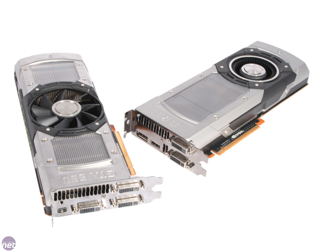
The pixels we see on our computer monitors are driven by GPUs, which utilizes a parallel computing architecture to process a series of images and displays them to our screen. The biggest GPU manufacturer, Nvidia produced three graphics cards geared for the Desktop PC Gaming/Professional crowd. These cards are the highest performing consumer cards on the market right now, and their design is simply one of the most amazing I've ever witnessed in a consumer graphics card. These cards have both function and design, though there is more design than function in play here. These cards are made of premium materials, featuring aluminum and poly carbonate coatings and laser etchings to provide a very classy look. The led with bright Geforce GTX etched onto the top, it is clear to gamers and professionals whose brand this is and which class of computing power these have. Very much like the two products before it, there is a great emphasis on white/gray as the color of choice because it represents something immaculate and pristine, giving it a touch of class.
4. Rhombus vs Rectangles
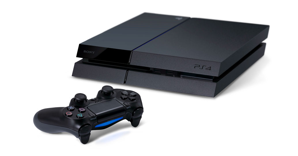
This isn't really a tech product, but more of the issue of shape. None other describes free-flowing design more than The upcoming PlayStation 4 and the Xbox One gaming consoles. I am personally heavily favored towards the PlayStation 4 design because of the edgy look of the console; it doesn't have the boring rectangle box of the Xbox One and it is offered in a slightly shorter (but longer) profile than the Xbox One. Not only that, but the Slot loading Blu Ray Drive and USB 3.0 ports on the PlayStation 4 are hidden from sight without it's two wedges, to not obstruct too much from the frontal facade. Likewise, the vents on the back is an example of intelligent integration, giving the PS4 a much streamlined look than the Xbox One, which has air vents across the top and bottom of the console. But, mostly, nothing says bad design like an old fashioned "Rectangular DVR". However, to Microsoft's credit, the device does utilize a modernist black theme with angular air vents to distinguish itself a bit further. It also scores extra points for having a very consistent design with the Kinect sensor included with the console. To some extent, the Xbox One keeps general design principles, but the rectangular shape of the console is not original.
Clever Air vents provides unique aesthetic and functional design
Rhombus design

Rectangular Design
Those Air vents are all over the place and a USB port on the side

Thursday, August 8, 2013

Personal Interest in Design Part II: Types of Design I Like

I talked about my origins in design in the earlier post, but I didn't talk about what kinds of design I am interested in. My interest in design ranges from many different things, from architecture to consumer devices to video game design. These are the main fields of interest in design I take an interest in.

Architecture: 
I personally enjoy modernist architecture because it offers great color contrast and abstract design. I am a big fan of the "futuristic" nature of these architecture. Houses like Falling-water by Frank Lloyd Wright serves as prime examples of this design - formalist cubes formed around an waterfall. Not only, that the building have beige with red accents to provide a sharp contrast between form and texture. Typically, my taste in color is also reflected by modernist architecture; I am a strong proponent of one, two and up to three colors in an design. In other words, I have a strong distaste for rainbow colors in Architecture because it detracts from the form of the structure. For example, the World Cup Stadium in Johannesburg, South Africa is a prominent example why I do not like colorful buildings. These colors are like colors that don't take themselves seriously, therefore why I do like them. However, of course, if the purpose of the building is to provide childcare, for example, then I do not have any problems with adding more than three colors. Architecture is much like Android Design (again) in that I believe it should first be functional, then stylistic. But my personal difference with Architecture versus Mobile App Design is Architecture must also achieve higher forms and aesthetic value. My personal philosophy is that if you are going to erect a giant building, then why not put effort into making it a very welcome place to be? If people simply decide to build everything based on rectangles and brick, then the world would be a very boring place to be. But architecture is also an reflection of personal and cultural values. Therefore the form is to be protected and promoted because it is an extension of people and their cultural values. Without style, how does the French or the Romans construct triumph arches? An arch made out of brick holds no significance, but the commemorative arches do provide cultural significance.
Too much red and yellow

Another bad example of color (Mexico City Library) - it may portray Aztec culture but from a design perspective, this building fails because of its color and a very boring form

Saturday, August 3, 2013

Personal Interest in Design Part I: The Foundations

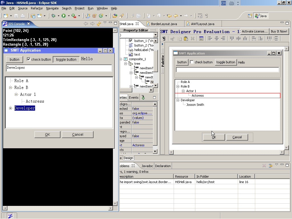
I would like to begin by stating the origins of my interest in architecture and design. You see, the first career that crossed my mind was Art. When I first immigrated to the United States at the age of six, my aspiration was to become an artist; the aspect of freedom captivated my interests. However, because of my youth, I did not commit long to drawing lessons. My passion for aesthetics remained, but my actual commitment waned. However, much later, I divulged in Windows designing, using Java to design the windows used in the Windows operating system in the form of SWT. This was actually my first foray into formal design.
This was a very informal intro into design - I learned what different buttons and parts of a windows worked together to form a coherent functional window. Groups and Tabs taught me virtual management while the logical progression of important programs such as Task Manager in Windows. While dabbling in Windows visual design, I felt that it was a very natural thing for me to do - everything fitted together with a very logical framework as I seamlessly learned the various ways to design a window.

Fast forward several years into my high school career where my dad persuaded me into doing taking the introductory Drafting I in High School. This class served as another gateway in my journey with design. While I was opposed at first to taking a "boring class", I later come to appreciate the value of such a skill. In Drafting I class, I learned to handle blueprints and design things using AutoCAD software.
This class had two profound effects on me; first of all it piqued my interest in the Art and Design field and second of all it introduced me to 3D visualization and precision design. The ability to visualize 3D objects and map them out on a 2D interface also introduced the aspect of prospective to me. With another year of formal architecture class, I was initially set on making Architecture my future career. However, the practicality of being an Architect forced me to reconsider my options. Now, though I strive to deal with Design in general and be able to be versatile with many different facets of design.

Thursday, August 1, 2013

Art vs Design and Color

The distinction between Art and Design is often times confusing for the casual observer; I strive to make this distinction in this blog post - in this post I will articulate the difference between Art and Design. In laymen's term, Art is an unrestricted expression of an individual, while Design doesn't have that freedom; it is bound by purpose and criticism. While it is possible to profit from self expression; it will have a limited audience because only those that share the artists vision will purchase the requisite artwork. While I'm not discrediting artistic expression; I find sense and purpose in design and with that, I will provide my own thoughts on the key differences between Art and Design.

Good Art Inspires; Design innovates.
Competition is what drives Design innovation; you want to be more competitive with your design, so you come up with better, more efficient design. Case in point: Jony Ive of Apple's design for the Apple Mobile Operating System, iOS 7 is very much Apple's interpretation of Microsoft's "Flat" Windows 8 UI.

Art is about re-inventing the wheel; sometimes Design is about incorporating the best elements that can maximize functionality. This is also a call back to the previous Android Design post about making consistent themes for Android so that it can be a seamless transition from home screen to app. 

Good Art is interpreted; Good Design is understood.
If a Design is flashy, but not functional, it does not withstand the criteria of good design; a unique artwork is subject to personal opinions on whether it is "good" or not. Good Design is understood through it's usage and application. If it produces desired results, then the Design will be categorized as "Good".

Good Art is a Talent; Good Design is a Skill
Art requires higher level of hand-eye coordination than Design; but a good Designer needs to have a high level of visualization so that it can plan out the Design ahead of time. To me, Art is the gradual perfection towards higher levels of brain hand synthesis; in that is indicates a high level of discipline and dedication. Design also requires commitment, but it is a more of Creativity and technical knowledge to succeed.

Good Art sends different messages; Good Design gives the same messages to everyone
As stated earlier, Art is subject heavily to personal interpretation, but Good Design will be structured in such a way that everyone should be able to have the same experience; it should ideally allow everyone to produce the same results (as in application design). However, as with art, things like Color and shapes will still play a role in determining individual responses to different styles.

In retrospect to all I said, I am an advocate of Artistic Design which is the pure fusion of Art and Design which is to achieve two clear goals; provide usability and functionality with an attention to the aesthetics. 

Tuesday, July 30, 2013

On the basics of Android App Design

Hello! I would like to present my findings and thought on these set of videos from the Android Design Website at http://developer.android.com/design/index.html. Under this website, we ;get to see a overview of the guidelines which Android developers should follow when they design an app for the Android platform. In this case, a series of videos, particularly this one, speaks of the philosophy behind Android Design and explains some of the key elements that make up the design of an Android app. Here is the video:
This video introduces not only the basic design principles, but it also shows the process that it takes to generate an effective design. To draw an analogy, the basis of functional Design is very similar to Maslow's Hierarchy of Needs.
This is basically a visualization of the order in which people delegate their efforts into and their relative importance. For example, a starving man cannot seek higher wisdom; he must satisfy his hunger first. Likewise, good, functional Design must fulfill the basic requirement for functionality, not just aesthetics. However, all apps must at least achieve a certain standard, which entails fulfilling the purpose, reasonable aesthetics and caters to the main demands of the audience. However, these core element must be met before an developer can help transform a good app into an excellent one. These are the little things like added functionality, a bug free experience and a better workflow ie. transition. These are the things that developer strive to attain. But how does a developer actually goes along and accomplish this goal?

Well, the guys in the video above has ideas; they strive to collect information first; a good app must be designed around the user experience. So, therefore, an observation of user activity can give strong clues as to how organize the app and its functional workflow. After establishing the actual usage, the first step of an Android app involves the main page, where navigation to sub-levels of the app could be accessed. THis main screen is extremely important and contains two key elements; the Action Bar 
                                         
This Action Bar allows streamlined navigation to sub levels; they can provide more advanced functionality. This bar can contain things like an overflow menu, search function and other things like a social sharing function. This bar is implemented in almost every Android app because it offers such a versatile functionality but also a consistent Android experience. Then of course, the next most important aspects of an Android app is the actual content in underneath the Action Bar. A good app has a great splash screen that will allow high levels of practicality and aesthetics. The sub levels will have to be cleverly interlinked with the rest of the app to allow for logical progression which will aid in user productivity. The actual design is often consistent; often times an Android app will only provide, to an extent different colors and orientation, but the assets are the same. The Assets Pack under the Android developer's site allows for Designers to achieve this level of consistency. While it is important to try and distance from the competition, but often times, if a user has difficulty navigating your app, It will sway the users to competing solutions; It is the Google experience and it allows the functional audience to expand, thus widening the market for the developer.

How do I make out of these? A lot. First and foremost, I believe that these videos and tutorials shows that unique Design is important, but sometimes keeping with consistency is also good design, but instead it is called good functional design because users aren't using an app to look at pretty transitions, pictures or text. Also, it introduces me to the idea of collecting data before doing any designing. Design has always been about the artistic creativity for me, but the function is still extremely important. Sometimes, when one indulges in a good design, they lose a sense of practicality and purpose. To set guidelines based on information collecting is a very good habit for designers. Overall, I very much enjoyed watching those videos, because it not introduced me to different design perspectives, but it also made me appreciate the work that goes into designing an app.