Saturday, August 9, 2014

Design in Motion: IBM Design Homepage overview

I'd like to bring attention to the brilliant excellence of IBM Design's website. IBM Design have created a new frontier for 2D design. As of early August 2014, when you visit the front-page, you are treated by transparent turquoise blue squares. Underneath the blue squares is something amazing: you can see the people at IBM Design studios moving about! There is no static picture underneath the layer! When I saw this in motion, everything makes sense: This is what IBM coins "Design in Motion". Indeed, to see IBM utilize this effect is amazing. To draw an Apple design analogy; it's like taking Apple store footage and putting that underneath an transparent gray canvas. However, it's not Apple that pulled this effect off; it's IBM. And that's where I get intrigued. This is some revolutionary techniques!

Of course web-page design is not without function, especially for one of IBM Design's caliber. This webpage uses the tried and tested method of using scrolling slides because people are inherently more comfortable with scrolling. Now here's where it gets interesting. As you transition to the next "slide", the menu bar also changes. The pane that says "Studio, Work, Career, Blog" changes both color, font and transparency to blend in with the dominant yellow background of the second slide. Because only using color and fonts are boring, IBM Design brought in some nice photographers and aesthetic sense to convey design (rulers, pencils, erasers, mac keyboard) to bring in the requisite design schema for this particular slide. Not only that, they integrated the bee motif into the lower right hand area. This is what inspires the color yellow in this particular slide. Finally, the turquoise-blue to yellow transition works because those colors compliment each other, so the color transition is not jarring.

The usage of red on the next pane are not purely based on aesthetic sense; IBM Design brings the first two slides with claims of "redesigning space". Well, they added something little more concrete: On the red slide, they put emphasis, with large font to convey that IBM Design also "craft great experiences". Combined with the red color, it is meant to convey a change in tone using color shifts. So not only does yellow contribute to a liberating feel, the red color emphasizes the special key point about "crafting great experiences". Because white is such a powerful color, the menu bar's background color stays consistent until...

The final pane suddenly shifts from red to white in such a manner as to create a lighter atmosphere and integrating the white menu pane into the white background seamlessly. IBM Design introduces itself on the first blue pane and then transitions to yellow and red and then reaffirms it's mission by asking potential designers join the movement. The changing people on the final pane is yet another tribute to the notion of design in motion. In addition to the non-formal text, this page is a perfect splash page for cursory visitors. The consistent inclusion of the menu bar means that more advanced visitors can access those functions anytime. Finally, at the top of the page, there is a changing master IBM menu pane that connects to the rest of the organization's websites. if you hover your mouse over that very top pane, it expands itself to include more information so that the user is not bombarded with unnecessary links. At the top and bottom ends of the page, the black background serves as a corporate reminder that IBM means serious business - that the IBM Design department is only one segment of the entire company. This increases the contrast between IBM Design's homepage versus the other corporate pages. In fact, this revamp of the IBM Design homepage also demonstrates a demographic shift. The bright colors and minimalism along with the young faces all pander to the young adult population. Because the general population are unaware of IBM Design, the people who view this homepage are likely young design hopefuls. This homepage successfully appeal to that group of people while promoting their design tenets. This is truly one of the most surprising webpages I've visited. 

Art Institute of Chicago Part III: East Asian Art - China and Korea

After strolling through the South Asian section, I came across the East Asian section of the museum. I was instantly greeted by the light turquoise colors of the Korean Celadon. This signified to me that I was at the East Asian section of the museum. I've only ever recognized Korean Celadon from the textbooks; essentially they are vases and eating ornaments that are crafted in such a way that they give off a light jade green glaze. Obviously, the technique to produce celadon originated in China, but the Koreans were the ones to really proliferate the usage of the unique pottery technique. Especially considering the time period, the only significant celadon production during the the 3rd century AD occurred in Korea. Even though Korea produced other forms of celadon, such examples were not on display at the first part of the exihibit. There are two striking characteristic of these Korean celadon. First is the amazing consistency in color, reflectiveness and the overall smoothness of the porcelain. The second is the remarkable condition in which it was presented. These pottery appeared to be extraordinarily well preserved. When confronted with these realizations, I come to better appreciate the qualities of the pottery.

Chinese section:
These are some of the most iconic bronze ware of the early Shang/Zhou Dynasty of China. Preceding even Buddhism, the ability to craft these fine wares using primitive molds was a major Chinese artistic innovation. In fact, these artifacts represent the first implementation of aesthetics into everyday items. There is a sense of style that is incorporated into these designs. With the usage of Bronze, these forms also carry a new permanence and wear resistance. In fact, the cup in the middle would serve as template for future Chinese cups in future dynasties. The greenish tint on these bronze wares illustrate the relative age versus the Buddhist sculptures. However, different manufacturing techniques may also make a difference. Bronze production was not controlled, thus may lead to impurities that affect the coloring process. Overall, in the context, these are very significant contributions to art and material engineering.

These clay/earthen models give incredible insight into the relative shape and structure of ancient Chinese dwellings. While the cutout of a house doesn't reveal too much, the white model on the right hand side tells us that Chinese houses are probably rectangular, with simple accented gable roofs. There are cutouts on the upper floor to serve as windows. This model shows us that ancient Chinese buildings aren't too different from the replicas that exist today. What's interesting about this depiction is that it was an approximate white depiction of houses. To create miniature models of houses in any ancient society is rare because these little models don't serve a functional purpose. Perhaps to enhance its aesthetics, the white house model on the right was painted white to blend in with the other ornaments in an home. These were not used as architectural models either; ancient Chinese architects did not use scale models. The models are too informal to serve as a building guide. It can also be speculated that these houses serve as relics of destroyed buildings. Most ancient Chinese buildings are wood-based which meant that constant warfare and fires can often obliterate entire sections of cities. Which is also why China's ancient architectural profile are dominated by places commissioned by the government or religious orders.
One of the most enduring characteristics of Chinese porcelain is the blue and white lacquer that was responsible for drawing European interest. This one in particular is not only well preserved, but it is also remarkably round and detailed. The circular shape is unique amongst Chinese porcelain. the side hands appear to be similar to the handles on Greek Amphoras. It can be surmised that this may be a wine container because the head is narrow. It may also not be a wine container; it could be just a display item to decorate homes. The shine on this lacquer is also exemplary, showing no signs of grime and dust. I was delighted to observe this fine piece of Chinese craftsmanship.
This may appear to be some sort of container, or treasure box to the uninformed eye, but this is actually an intricately designed pillow. Now though, these pillows aren't stuffed with cotton, instead this pillow is made of a type of hardened clay. What I liked about this pillow was the green colorings on the pillow patterns. Especially in contrast to all the beige, white items surrounding this pillow, the color used makes it stand out. While I have a hard time imagining sleeping on these, these probably served as status symbols for the ancient Chinese aristocracy.

Overall, I was surprised by the monotony in the Chinese and Korean section. Much like the Southeast/South Asian section of the Museum, the Chinese and Korean section focused nearly exclusively on pottery and everyday items. There little tapestry, clothing, painting and other forms of art. Even still, the bright color and exquisite detail panders to the technical excellence of Chinese and Korean Art.

Art Institute of Chicago Part II: Southeast and South Asian Art

After visiting Koudelka's photography exhibit, I came across the Southeast Asian exhibit, where I explored the unique aesthetics of ancient Southern Asian Art. The exhibit was held on an open floor with red accents. Also of note was the fact that the exhibit floor was constructed in such a way that also serves as an intermediary between two different sections of the museum.
This was the largest statue in the exhibit. It was an Indian relief of the Buddha. The most remarkable thing about this statue (sculpture) of Siddhartha Gautama is the amazingly flat back that this sculpture has. this flat back represents the tenets of meditation. It demonstrates great ability to maintain posture. When believers observe this particular statue, it may motivate them to achieve the same standards of rigidity. While the usage of a white base is not uncommon in museums, it gains new significance when placed underneath the Buddha sculpture. This is actually more of a bronze sculpture, likely created using a mold. The ability of the sculptor to create the details on this sculpture is meticulously brilliant. Obviously, close attention was paid towards the material - much of the details remains intact after hundreds of years. Overall, this sculpture really only served as a starting point for Buddhist bronze sculptures.
This one has many of the same elements as the previous large Buddha sculpture, but this one has far more detail. Because bronze cannot be carved, the amount of detail present in this bronze panel of the  Buddha and his followers are astonishing. It requires the artist to make a mold for this. Considering the age of this panel, it reflects the remarkable ability of the artist to create fine details. Another artistic mechanism is present in this sculpture: namely the juxtaposition of size to indicate relative importance. Even though the human form of Buddha is human sized, his importance to Buddhism meant that he is the largest figure present in this sculpture. Another thing that is also notable was the sense of hierarchy present in this sculpture. The Buddha not only sits on the upper level, but he is also centered. This dutifully lays out the order of importance. These two artistic techniques would remain relevant for years to come.
This is the emblem of the Hindu god Shiva.  This may be the most simplistic sculpture in the entire gallery, but it conveys something deeper. Namely, it can be interpreted as the amazing power of the god Shiva. From some infinite circle, it evolves into the octagon and then finally takes a concrete shape as the object created. Without religious implications, this sculpture demonstrates a very nice progression between different shapes. It invokes sense of transfiguration in a stationary object.

This is interesting, because the statues in question are not placed at eye level. Instead these heads were elevated to what I believe represents the height of the sculpture as if it retained the body. This is a masterstroke on part of the museum, not only for security purposes, but also for aesthetic purposes. I really like this implementation.
This is probably the most well known sculpture in the entire gallery. I've seen this in the art history textbooks before. This is a surprisingly symmetrical bronze sculpture featuring the God Shiva triumphing over demons. The graceful pose of this sculpture can be reflected in many traditional Hindu dances. I was surprised by how small this sculpture seemed. I was expecting this to be slightly larger. Considering this sculpture's size, I'd imagine it to be used to mark an small scale altar. To see it in person is truly different from seeing it from a textbook. This was certainly the highlight of this gallery so far.

I liked the South/Southeastern Asian gallery because it represents the earliest Buddhist artwork. In addition, I got to see bronze sculpture skills truly diversify from only utility purposes. In other words, bronze working was confined to utensils, weapons, ornaments, tools until the expansion to religious motifs. However, as I've mentioned, this entire gallery was almost exclusively based on bronze sculptures; There was one tapestry with everything else made of bronze. I'd like there to be more diversity in this gallery, but the quality is certainly stupendous.

Thursday, August 7, 2014

Art Institute of Chicago Part I: Josef Koudelka Nationality Doubtful

I've been in Chicago for the last the couple of days. In these days, I've been exposed to a variety of different Architecture and other art styles. Yesterday, I went to visit the Art Institute of Chicago, where I went through an exhibition of art from different time periods. I'd like to start a multiple part series about the different parts of the museum and the requisite art periods and my own analysis on them.

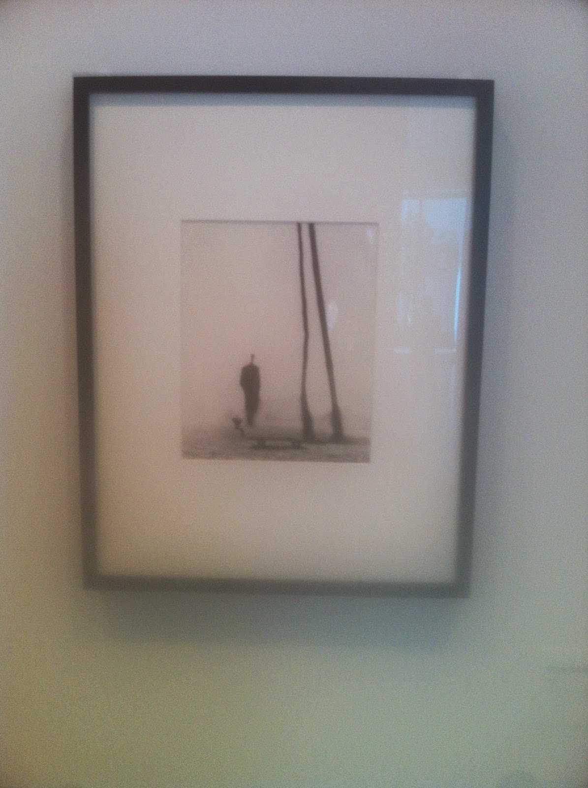
I'd first stopped to observe Josef Koudelka's photographs. This was the first exhibit that I went to. Josef Koudelka was a Czech of French descent. The name of the exhibit was Nationality Doubtful, which serves to illustrate the contrast between freedom and Soviet Occupation experienced with Koudelka's respective countries, France and Czechoslovakia. Though his initial photos did not focus on the Soviet Occupation of Czechoslovakia, he did dabble in a new photographic effect. He appears to be a pioneer of extreme soft focus. These first couple of photographs best illustrate his pioneering abilities.


Through these photographs, you can see the rough outline of the subjects in the photographs, but it is not distinct enough to make out the individual details. Incidentally, this also gives the illusion that his subjects may appear as ghosts. His compositions also show a degree of balance, as in these three photographs, there are two subjects that balance each other out on both sides. These are what makes Koudelka's early works so unique.

The resulting Cold War period was certainly an anomaly and Koudelka realizes the potential of photographs to successfully capture the struggle of the Czech people against the Soviet excesses. These are the resulting photographs that occurred as a result:


Josef Koudelka's ability with photography is further enhanced with these shots. These photographs must have been rather difficult to take. First, these photographs are almost exquisitely taken, with no motion blur. All of the subjects in the photographs appears to strike the perfect gestures. Second, Koudelka was taking these photographs using older camera technology, which has longer photo processing than modern point-and-click cameras. Third, Koudelka was attempting to take these photos in a rather volatile area, so it demonstrate his personal bravery in taking these pictures. While it was never explicitly stated, these photographs may be used to demonstrate the contrast in freedom between Czechoslovakia and his adopted France. These photographs are also notable for being some of the forerunners of a style of photographs suited for journalistic motives. These photographs have the angle, perspective and emotional setting to find it's way on the front of newspapers. These photographs are the beginnings of similarly constructed photographs of armed conflicts.

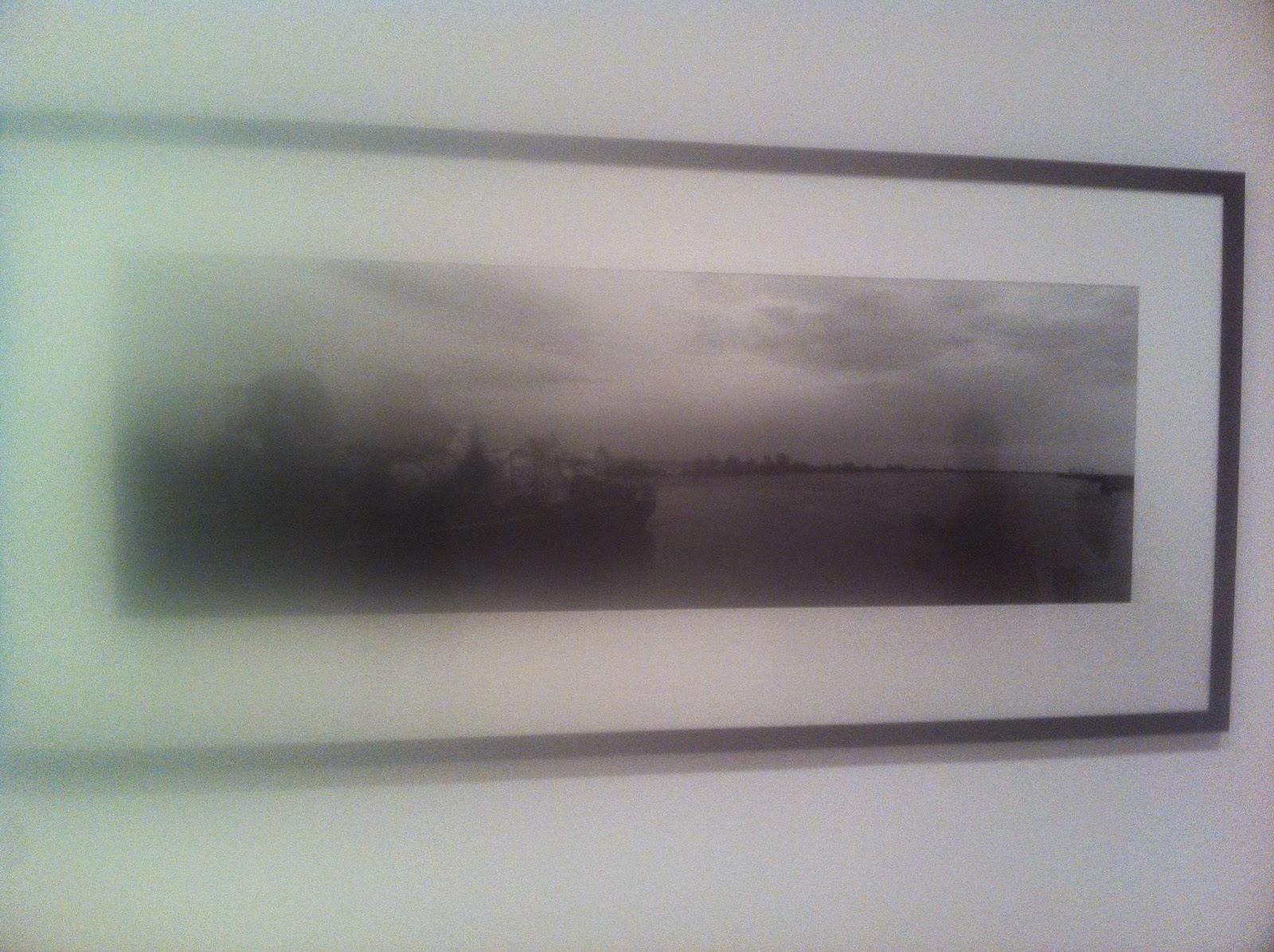
Josef Koudelka was also a pioneer of strange but picturesque landscapes. These photos illustrates his ability to capture amazing landscapes.

These photographs, especially the first one create a sense of mystery. It appears to be at the base of some form of mountain, but it isn't clear where it was taken just form looking at it. Indeed, it looks rather otherworldly. The prevalence of black and white photographs in the past certainly gives everything an aura of uncertainty. His panoramic shots are amongst the first of his generation; he was able to combine these photographs so seamlessly. These photographs also reflect the changing political landscape; he no longer have an obligation to take photographs involving the Soviet Union any more. Instead, he is able to devote his talents to exploring the various peaceful constructs of nature. After I saw Koudelka's gallery, I am indeed impressed with the vision and ability of this man. I did feel that the exhibit did not do a very good job of making the concrete connection between his nationality and his vision of photography. Nevertheless, I enjoyed this exhibition in the Art Institute of Chicago.


Tuesday, July 29, 2014

Interior Exterior Modularity

Architecture is in an interesting crossroads today. When we look back at the ancient architecture, we see interior and exterior design to be inseparable from each other. 
For example, this mud house's interior wall is shared with the exterior one, as both interior and exterior are one cohesive unit. There is no contrast in entrance and exit. Rather, when you walk into this mud house, you expect the inside to be mad of mud as well. In the earlier days, function was valued over pure aesthetic form until civilizations like the Greeks began to diverge from the ancient structural monotony. 
Even though architecture began to diverge from simplisitic shapes and forms, there still remains no difference between the interior and exterior. The Parthenon was a marvel of marble, and it was completely immersed in marble through the entire structure. You don't walk through the Parthenon expecting the interior to be made of gold, though the statue of Athena certainly was made of gold.

Fast forward to modern times and we see a growing and distinct difference between Architecture and Interior Design. In fact, as we get technologies like air conditioning, there was an aesthetic and physical need to change the interior design to differentiate itself.

If we look at the exterior of this Japanese house, we see two distinct monolithic white blocks. However, we cannot extrapolate anything rationally about it's interior from the exterior. While the actual interior of this house demonstrates a stylistic consistency with the exterior, you could easily swap out this mellow wooden interior with mahogany woods and blue paint. Or the bedroom of a possible young female occupant may be painted pink. In today's world, there is no longer a clear line between interior architecture and exterior architecture. As stated, these two disciplines are now demarcated as Interior Design and Architecture. In certain cases, like the James B. Hunt Library, some parts of the exterior architecture are essential to the interior design and structure. This is an example of continuity between interior and exterior in modern architecture.

However, this rift between interior and exterior becomes prominent when you observe even larger buildings. 
This hotel, the Godfrey Hotel in Chicago certainly take some of it's cues from the HSBC bank in Hong Kong, but when you consider the interior, it leaves everything purely to the imagination. Given this physical structure's constraints, supposedly it has to include rooms and amenities for the visitor. But in what style? The exterior of the building suggests to include perhaps something modern. However, it does not need to conform to that standard. If this was placed in Abu Dubai, then perhaps the interior could reflect Middle Eastern sensibilities or Western motifs. There is no distinct continuation between interior and exterior. To this regard, people in residential and public areas are now more focused on how decorative the interior is. Large chain stores like Lowes and Home Depot in the United States offer the DIY enthusiasts to furnish their homes.

This phenomena isn't a coincidence. It has worked in tandem with modernist simplicity. The design idiom of today could probably be to "increase the inside because we spend more time inside than outside". For example, our local YMCA can do away with interior renovations because the outside facade is nothing to admire. These interior renovations make more of a difference for members, and that's the desired result.

In fact, I believe that Interior design has almost supposed exterior design, such that a traditional importance scale has been shifted. As architecture become more simplistic, interior design will become the differentiating factor between buildings. The irony is that the futuristic architecture portrayed in science fiction media like Tron: Legacy seems to return to the fusion of interior an exterior architecture. Perhaps we may move in that direction.


Friday, May 9, 2014

Iconography: A brief case study

Iconography is popularly associated with things like Egyptian hieroglyphs, Illuminati logos, the eye on the top of the pyramid at the back of all the one dollar bills. I do not wish to delve into the secret and supposed conspiracy theories behind these arcane inscriptions, but rather the aesthetics of iconography through the modern period and it's relation to modern design.

Icons as described can mean an religious figure of ardent devotion, it can also be used to denote important figures or it can mean a symbolic representation of some concept. In context of modern design, icons is a superset of logos and other representative symbolism. Specifically, I want to focus on the modern relation of logos to ancient iconography.

Before the conception of corporations, existed different entities of worship. The earliest known usage of icons in the English language existed for figures of divine descent. These icons were represented in altar form as a means of representation of it's brand. A woman with a baby with halos behind them was the signature of Mary and baby Jesus. This was a colloquial representation, a form popularly known across Christian Europe. Compared to Roman Denarii, with their portraits of Roman emperors, those were known as a relief, a representation of the emperor's likeness. It wasn't called an icon, it wasn't created to proliferate knowledge of the current emperor; word of mouth already conveyed that information. Icons are representative of not just some figure or concept, it was integral to the spirituality of nascent Christianity.

The term icon in relation to important people or landmark events wasn't termed explicitly, but rather interchangeably. After the desolation of idol worship, the term icon came to represent more secular concepts in  the English lexicography. Phrases like iconic inventions or an icon of the Gilded Age was used more frequently. Perhaps because the proliferation of railroads decreased communication latency, the successful have reached a from of cult status from their contribution to the Industrial Revolution. The Industrial Revolution is often remembered by history in relation to their icons - the notable individuals and events that shape the brand of the Industrial Revolution. Because the Industrial Revolution would so heavily impact politics and economics in the coming century, these innovators and their inventions have garnered worldwide relevance. The light bulb, the steam engine are all hallmarks, or icons of the Industrial Revolution. Thomas Edison, James Watt are similarly considered icons of their age.

There is an argument to be made for those that preceded the Industrial Age. To modern observers, Leonardo Da Vinci is admired and hailed as an icon of art and engineering. This is because we have more sophisticated intercommunications that allow us to all objectively espouse Da Vinci's legacy. While it's true that those in the West during the Industrial Revolution might share the same sentiment, the still limited communications and cultural interactions between these countries prevent Da Vinci from being an icon in Industrial Europe. The lack of cultural interactions is attributed to the rising ideology of nationalism. It is only today, with the eyes of the whole world, do people universally applaud Da Vinci's work and immortalize him through the widespread admiration of the Mona Lisa.
Therefore, the existence of icons being applied to important people or events is purely a matter of modern perspective. It does mean that the people in the 19th century necessarily agree with modern citizens.
The icon of Leonardo Da Vinci

The shift in nomenclature appellation of icons to scientists and inventors shifted during the meteoric rise of Elvis Presley, who ushered in the liberation of music through saucy gyrations. His upbeat music set him as an icon of the fifties, albeit one of the entertainment industry. Despite being part of the entertainment industry, the fifties was the period of youthful expression, spearheaded by Elvis. He became the face of not only the music, but also the changing political atmosphere of the baby boom generation.
iconic figure and social icon of the fifties

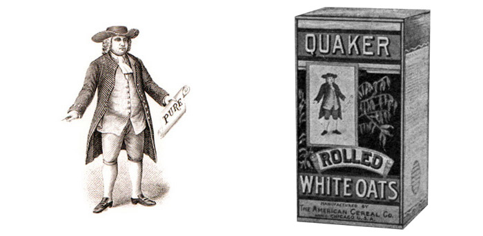
It was during this period that saw many of the modern juggernauts of the modern age. Wal-Mart, McDonalds saw it's origins in the 1940s. Along with the new economic boom saw a need for brand recognition. McDonald's original logo signaled a new epoch in the meaning of icons. Gradually, icons became cornerstones of a business, becoming the front-line in brand recognition. Quaker Oats, for example also saw an increased role in solidifying their Quaker by simplifying their mascot from a random, 18th century political cartoon style character to the friendly Quaker that we come to recognize with the Quaker name. This period saw an increased use and importance in the creation of icons.
Original McDonald's logo
Original Quaker Oats logo

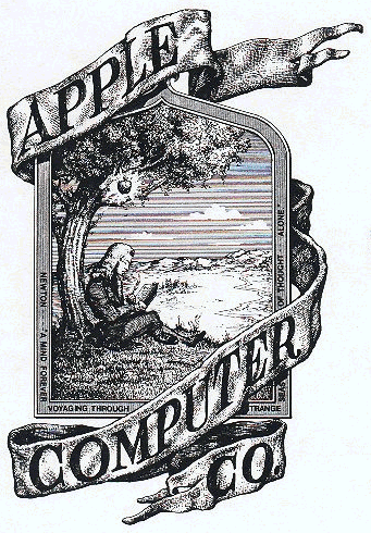
It was soon clear in the new market dynamics, virtually every business would need an icon to represent themselves. Apple's logo went through many revisions because they realize that an icon by itself can convey a huge amount of information to consumers. Or, it was when IBM shifted towards it's famous stripped letters logo so that people can identify with IBM quality. While our history books refer to the past successes as "icons", we synonymously associate icons with both historical icons and corporate/individual icons. 

The advent of the Internet Age witnessed increased abstraction in logos, particularly in the are of virtual logos. While past logos may involve a certain degree of skeumorphism or less saturated colors  or even an anthropopathic mascot. Overall, the logo design today tend to be more balanced in terms of color, less complex, but more formless in an attempt to stay original. The twitter, Facebook, Google, instagram, etc. logos are all symbolic of their respective companies, but very iconic. They are icons of the internet age. The Facebook like icon follows their blue and white color schemes. This stands in contrast to the colorful cacophony of the second Apple logo or even the boring black and white overtones of the original Apple logo or original Sherwin Williams ones. Design for websites and digital contents have less apt to be artistic and detailed, because people's attention span aren't draw to black and white pictures. This is also in direct proportion to number of skilled digital artists and advancements in other form of design. The Post-modernist Architecture movement also required the evolution of logos in order to synthesize an aesthetically pleasing environment. These include a deconstruction of traditional building elements to throwing together traditional shapes into a work of streamlined design. These same concepts carried over to design, where icons was made to attract customers and make it recognizable. Icons by today's time have received such prominent emphasis that sometimes people make purchasing decision based solely on brand recognition. 
Original logo is black and white
Also in black and white. This is Sherwin William's first logo.


Tuesday, May 6, 2014

Good Design isn't marred by bad concepts

Recently, I've started to chirp. I mean, I've started to use Twitter a lot. I'm going to base this blog post on this tweet:

Basically, the concept I wanted to convey is the notion that good design doesn't have to be symbolic of good products or purpose. Good design is what we perceive ourselves, through objective examination of colors, shapes, angle, depth, font and spacing. Our eyes do not judge the merit of the purpose in these designs. I think that this quote here sort of extends my idea further out:
Because design is ingrained in our psyche to serve purpose, it becomes difficult to separate it apart when it we need to look at a design objectively. Even still, by designing something to serve an unjust purpose is to also try to utilize design to spread the unpopular message. Design is for a purpose, but it's also possible to design something good for a bad idea without explicitly having the aim of promoting the bad concepts. For example, the overall design for Breaking Bad, a hit show about a high school chemistry teacher turned meth lord is based around the green chalkboard and the periodic table. It's a very respectable logo and it is extremely symbolic of everything the show is about. Along with the promotional covers for the show, the usage of green white shows an example of purposeful color combination and an overall aesthetic that's respectable. The creators of these logos could simply create some other arbitrary logo or overall design, but they went with a very respectable design. While the show apparently garnered widespread acclaim,  there are a group of people that argue that the premise of such a show (about drugs) contributes to the stereotype of popular media as glorifying America's drug and gang culture. In this aspect, the attention to design, promotional artwork seems to some people as a ruse for the immoral content of the show. It's not the best example of a good design being used to promote something bad, but I think that this example rings true to my case. In fact, the very design of the latin alphabet is but what we append the meaning to; they can also be mere scribblings that have no logical explanation for their form. I make such a deal out of the logo of the show because the logo has commercial value; the unique design is what attracts the viewers to the show and allow them to identify with it. It is on the front line of the marketing efforts of the producers of this show. It would be analogous to compare this kind of promotional work to somebody creating a brilliant logo for the devil, though this example is rather extreme.


The overall statement is that, even with the context of drugs, the Breaking bad logo and related merchandises succeed in representing what it seemed to represent and the overall aesthetics reveal a careful and refined approach to design that makes it appealing to us. The design aspect isn't marred by what it represents. However, in everyday life, it's not practical to apply these distinctions because it's easy to simply permanently bind the design and the concept together because of society's conventions.