Wednesday, October 5, 2011

Arch Daily Analysis II

(This is the second installment in my analysis of architecture showed in the Arch Daily website)

Pavilion for the Artist, Amsterdam, Netherlands

Talk about integration with nature! By coating the exterior with glass, this building give the illusion of being integrated with its surroundings. This building is unique not because of its physical shape, but rather unique because of its statement regarding nature. The building tries to convey the loss of nature through buildings and human expansion. The mirror reflected the beauty of nature what would have been kept in that state had humans not intervene. Such ecological statement is furthered when you consider its location; in Netherlands, the population density is very high, and human expansion is a constant threat to nature. In essence, this architecture can be both attributed to the Green movement and a form of protest architecture.


Balancing Barn, Suffolk, United Kingdom


This building might seem like something out of another dimension but it still obeys the laws of physics. This building utilized the simple method of making the end that is on the hill heavier while keeping the longer hanging end lighter (ie less furniture). This balancing barn was able to distinguish itself because it seemed impossible to balance a building in this manner, but this architect has managed to balance the structure. Great aesthetic concept.

Sou Fujimoto: Final Wooden House

There have been debates over this architectural piece's integrity as an legitimate piece of architecture, I feel that this piece of architecture is legitimately a piece of architecture because of its ability to provides these people with adequate shelter and entertainment. The complete integration of nature with this one doesn't disqualify it from being a full fledged architecture, though; the Pavilion for the Artist in the Netherlands also has such features. Despite not serving all the possible functions of architecture, this one clearly fits with the definition of architecture. Also, this piece of architecture does keep in touch with the traditional Japanese asthetics of simple yet elegant designs.


Friday, June 24, 2011

Arch-Daily: The fastest news source on architecture

After my visit to Weinstein Friedlein Architects, Ellen shared a great site on Architecture called Arch Daily which highlights some of the most intriguing modern architecture today. Using this wonderful news source, I was able to pull up some very interesting architectural works. Amongst my favorites that I pulled up:


Cinema Pushkinsky, Moscow, Russia proposed renovation

(the last photo is an proposed renovation of the Cinema Pushkinsky out of about 512 entries)


Who says that architecture has to be from the ground up? Even though most architecture are indeed from scratch, this one has brilliantly evolved throughout the times in a stunning transition to a full fledged modernist architectural piece. If we can define brilliance in terms of how well it with no background in architecture, this building looks like any other new modernist builiding. Except that this building has a history dating back to post-Stalinist Soviet Union. No only does the renovation inclosed the front deck in modernist fashion, the architects of this renovation also added video capability to its walls so that it would illuminate in videos. Unlike some of the other proposals, this one retains the basic look of its past rather than merely boxing the entire structure up. Also in consideration is the fact that this structure calls for a minimal budget due to its relative simplicity. However, this design succeeds because it clearly redefines the cinema by giving it an modernist twist without any excessive additions. Also, the glass symbolically represents the timeless nature of the arts; the arts would never grow old. And so, in a sense, by keeping this cinema in much the same shape as its earlier incarnations, the cinema itself has achieved a timeless quality.

Parasite Office, Moscow, Russia


This piece of architecture in Moscow features a very interesting concept. To quote earlier, "who says that architecture has to be from the ground up. Quite literally, not all buildings have to touch the ground, as this building proves. This building is an excellent of one of the tenets of architecture; that architecture is some encompassing space; this one makes great use of that gap between the two buildings to mold into a office space. Also, this architecture takes advantage of the fact that it is sandwiched between two office buildings so that it does not need an foundation; so in a sense this is an inhabitable bridge. That bridge definition is extended further when you notice that the building doesn't obstruct the roadways underneath. Not only does this building offers utilitarian advantages, its architecture, both inside and out distinguish it self in its creativity and usefulness. From an inside perspective, I love how the building takes advantage of the brick wall of its right side neighbor; rather than adding a separate wall for the building itself, the building "borrows" the walls of other buildings around it to save weight and costs. However, from an outside perspective, this building has clearly made a statement of futuristic architecture; its abstract design references the uncertainty of space; the future of the gap between two buildings is an mystery until someone decides to build something concrete there. Much like air, space is unpredictable. And therefore, architecture belongs to the same plane of unpredictability as air. Until, someone decides to build something there.

Tetris Apartments, Ljubljana, Slovenia

Not only does this architectural piece has interesting composition, but the name also seemed to fit well with the design scheme of this apartment complex. While certain modernist architecture tend to truly stand out, this one nicely blends in with the surroundings because of its dark brownish and chestnut colors. Even so, this building still stands out with its odd mix of "cubes" that seem to form letters with their facade. The best thing about this architecture is its complimentary name and style . True to the Tetris namesake, this building does seem to imitate the different blocks that Tetris contrives. Not only does this building do a good job of expressing "Tetris", it also does a great job of providing accommodations with its particular design. porches are an instant amenity to this apartment complex thanks to the cubical design and the Tetris influenced shapes on the facade. Perhaps more than just an design statement, this building makes a homage to the connections between Tetris and architecture. Tetris, as everybody knows is about trying to put together pieces of random shapes so that they form a continuous row of blocks; the player must not build it all the way to the top. This building attributed to the fact that Tetris exemplify what Architecture is for: Buildings. And Tetris is all about building blocks. Even a subtle reference can make a big statement, as architecture is all about buildings; even above the design and engineering aspects of architecture.

Thursday, June 23, 2011

A visit to an architecture firm! Weinstein Friedlein Architects

This morning, I got the amazing opportunity to visit an architectural firm. I went to visit Weinstein Friedlein Architects, who is based in Carrboro.They have some brilliant architectural works. I was able to meet one of the head architects of this firm, Ellen Weinstein who gladly showed me around her firm. She introduced to some of her firm's works which included models, technical plans and renderings. Showing me around her firm was an enlightening experience, as she concluded by giving me four great advices; keep on working on this blog, read Architecture Daily for everyday architecture news, and keep a sketchbook and practice with Google Sketchup. While these tasks may sound specific, they are areas where I could improve my exposure to architecture. Architecture Daily is a great resource that she introduced to me because it allows me a daily glimpse of architecture without having to search for them; they allows me to find more architecture to blog about. Sketching is a necessity because it develops the cognitive ability to visualize. While showing me around her firm, Ellen showed me renderings that were done in Google Sketch-up but later colored in to show texture displayed to me the importance of using Google Sketch up because 3D renderings using AutoCAD could be clumsy. These advices were very helpful. Thank you Weinstein Friedlein Architects!


Wednesday, June 22, 2011

Hong Kong man maximizes space in tiny apartment

Hong Kong is a city of seven million people bounded by a tiny patch of land and an island. For millions of its inhabitants, small apartments are the norm for housing because land space is at a premium. Inspired by this need for space, a Hong Kong based architect decided to revamp his tiny corridor of his apartment so that he could maximize the amount of usable space. How does he accomplish this? He makes everything movable so that he could have a kitchen, a bathtub, a bed, a TV and virtually everything that he needs to live with, including a hammock.


Looking back on my comments regarding the West Point Bridge Design program for NCSU Engineering Camp, I mentioned micromanagement. Well, this Hong Kong architect does exactly that. Micromanagement. Depending on context being used, maximizing space could be a very important strategy if human population growth and urban development continues to increase at high rates. Even if efficiency isn't an absolute necessity in places like the US, this concept could be helpful for families who cannot afford to pay the huge lot fees that comes with houses. Usually lots are amongst the most expensive portions of a house. Using this method, a family could squeeze alot of things into just a small amount of space. Of course, the constant moving and pushing could become a negative factor for families. As of now, there isn't a practical way of putting this concept en masse. Even if it isn't viable to apply this commercially, the concept of dual tasking is important when designing houses because, again of huge lot fees and heating/cooling spaces in homes. One of the problems associated with many homes is that the dining room is almost never used, and it takes up unnecessary space. Perhaps, if people think like this Hong Kong man does, we could eliminate alot of waste.

Monday, June 20, 2011

James B. Hunt: Library: Futuristic Architecture at NC State University


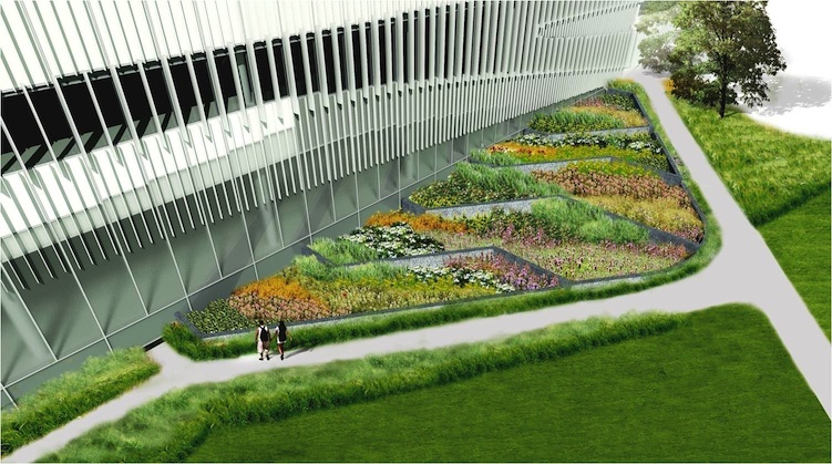
During my stay at NC State for the Engineering Camp, a new architectural piece was introduced during Day 2 for the afternoon session. I had the honor of watching the architect of the library give a presentation on this new project. Even more intriguing, however was the ability to actually visit the building under construction. This invaluable visit allowed me to reinforce my knowledge of interior architectural components. Inspired by North Carolinian tradition of textiles, the structure seemed to exemplify this concept by making the windows zigzag around the building as if like a ball of yarn. While some modernist, even futuristic architecture tend to employ organic, random shapes, the Hunt Library effectively binds the past and future effectively together; even while the building show futuristic tastes, the concept remains faithful to the past. More impressively, this building also embraces the green trend by decorating the entrance to the library with a type of vine in decreasing fashion as if to integrate the plant with the building. An extension of this concept can be seen in the first picture where a patch of garden is plotted outside the library; implicitly establishing the importance of nature to the textiles industry; cotton is essential to the textile industry. Serving as a contrast to the whiteness of the library, the greenery around the building adds a touch of color but at the same provide a comfortable and pleasant lead in to the building. Another noticeable feature of the Hunt Library is the Blades on the sides of the windows. These blades gives the building natural shading from horizontal sun rays. This allows the building to keep cooling costs down during summer.

This rendering of the southern side of the library nicely snows the illusion created by differing elevations of the viewer and the actual building. While the side facing the viewer seems to be imposing, the longer side of the library doesn't stand out. This effect works because the length of the east facade isn't as short as it appears from this perspective; the viewer from this angle could only perceive the side facing them. Through this, it is easy for the viewer to underestimate the size of the building. This displays the use of interesting perspective; It displays uniqueness and a shrewd use of the site to create special visual effects. The south side of the library is quite interesting; the use of nothing but glass at the bottom seems to make the building on the south side protrude even more into the viewer's plain of view. The use of an all glass bottom a the south elevation also has aesthetic value when viewed from the indoors; nature could be observed from all three sides at the south elevation. This is what I call "smart building".
Back to an earlier comment on how nature can make a great entrance way; the distance from the
pathway to the library defines what and how landscape architecture and architecture should synchronize together. Sometimes, architecture in itself isn't always adequate. That's where Landscape Architecture plays its role; especially with architecture with a monotonous scheme like the Hunt Library. Had this Library been flanked by nothing but a white plaza, it would give this building the impression that people have of a giant statue. However, architecture could accomplish more than merely as a showpiece. It has function. And libraries are supposed to give students a quiet and pleasant environment in which to conduct their studies. The greenery allows the students to feel relaxed walking towards the library rather than walking towards some imposing white and black building. Landscape Architecture allows Architecture to have more expressions, to lead people in. As with the South elevation, perspective plays a strong part in defining this architectural piece. The side of the library bending away from the viewer's plain of vision gives the library character; it shows yet another masterful manipulation of viewer's perspective. Just like the south facade, the east elevation makes the building smaller than it actually is; all because part of the east facade is bending away. The way this building manipulates three dimensional perspective is truly exemplary.When I went to visit the Bird's Nest in Beijing (Olympic Stadium), I was amazed at how small the stadium seemed to be on the ground level. Later I realized, the seats extended well below the ground level in order to achieve the kind of scale required for Olympic uses. Similar concept here; the height of the building is being extend down to ground level. While this concept is common in modern day architecture, it is quite a monumental task to apply this concept to such an enormous structure. Once again, this building has proved itself a building of many dimensions. Also, this design seemed to further reference the textiles history of the state, the windows on the facade could emulate the warps and wefts in weaving (see the middle of the building).

The Interior:

This lobby area is considered the biggest individual portion of the library. This part of the library does an excellent job of displaying the size of the structure. This rendering only show the first two floors; it makes great use of space to allow sufficient ambient sunlight to light up the lobby during daytime.
This rendering displays this interior's iconic light bulbs. Rather than wasting glass and other materials on making the casings for fluorescent light bulbs, the fluorescent light bulbs are installed directly on the top of each wall. not only does this save plastic, glass and other materials, it allows the roof of each level to maximize their height. Not only that, the shape and design of the light bulbs goes well with the futuristic theme of the library. This makes the library appear streamlined and efficient. This rendering shows the importance of having a balcony in the library; without it, the library might appear darker and shorter on the ground floor. Balconies are important components for large public buildings because they create a feeling of space. A large reason why this library is able to afford such a huge balcony is because of the automated book delivery system which keeps all the books in an extremely compact space to maximize public use space. This automated book system will be discussed later in this post.Love how it can transition from a feeling of massiveness to a feeling of closeness as it can be discerned from this rendering. The wall level on this floor draws an stark contrast to the opulence of the lobby and balcony spaces.

Considered a more transitional room, with the classic wooden furniture and study rooms, this room is particular striking for its version of fluorescent light bulbs, which seems to mark the study area. I like the transition space from the lower study area with the individualized study cubicles. Rather than being on the same elevation as the general study area, the cubicles are located on top of the bookshelves to make use of space that would have been wasted by the tall expanse of the ceiling from the bottom of the cubicles. Overall, this space is cleverly designed for students to study.Gotta love that yellow color. This color is great for people who needs accommodations as well for ordinary people too engrossed in their favorite book to walk down a stair case. This color choice is suitable for easy navigation; yellow stairs could serve as a "route" through certain areas of the building. The yellow is also light enough to blend with the white; that is it doesn't distract from the overall color scheme. Of course, the library is a place of silent studying. Black or dark colored places could change the atmosphere of the library.
This site plan shows what the architect of the Hunt Library described as being the "cornerstone" of Centennial Campus. He described his library as facing two different angled sides of NC State's Centennial Campus; you can see that the east and west sides of the library are aligned to different parts of the campus. Another feature of the library is that it bounded the court and overlooking Raleigh Lake for a great scenery.

The Automated Book Delivery System (ABDS) Machine:
The Hunt Library differs from conventional libraries that all the books do not go in bookshelves where people can take it out and read. The Hunt Library keeps all its books in this large room. If a person requests a book, he/she could search it up on the computer and request it. There will be an online catalog that would have features like virtual bookshelves to help the customer find the book that they need. When a book is requested, one of these four robots would scour the corridors and go to the exact shelf in the storage area and retrieve the box to which an librarian selects out the one the customer needs. This is a smart way to do things in my opinion because it eliminates the possibility of book theft, premature physical damaging of books. Not only does it serve security reasons, it also improves efficiency, as librarians don't have to search the library manually. Instead of wasting five minutes for a book, the computer knows exactly where a book is located, thus saving time. Also, librarians wouldn't have to re shelf books when people return them. This system saves human labor as well. Of course, given the high tech design of the Hunt Library, it wouldn't be surprising that there would a robotic librarian to go with the futuristic theme.

Overall
:
James B. Hunt Jr. Library is a masterpiece of architecture. It has many elements to distinguish itself from other buildings on the NC State campus; the use of perspective, technology and statement all combine to form this great architectural masterpiece.


NCSU Engineering Camp 2011: Civil Engineering part 4

Day 4: Water Filters
The first half of Day 4 consisted of designing an water filter in an clear plastic cylinder out of coal particles, sand and gravel. Our objective, of course would be produce the cleanest water, but the quality of water isn't the only factor; time and cost are factors. Water quality accounts for roughly 70 percent of the score; the other two components are 15 percent each. Because each team starts out with one bag of each ingredient type, the cost isn't going to differ too much from group to group. The reason why each group might have similar amounts of ingredients is largely because to achieve favorable speed, there must be a favorable pressure.

Because p = ρgh where p and g are constants, a greater height is required to attain a greater pressure. Therefore, people did not want a filter that would fill all the way to the top of the cylinder because there isn't enough pressure, hence velocity to move the water through the filter. Our instructor mentioned a group in the 2010 Engineering Camp which filled the filter all the way to the top and the entire filter became clogged instantly; no water was able to move through. To stay competitive, everybody kept the filter to approximately half of the cylinder's depth to allow sufficient pressure to allow water to pass through the water filter.

Day 4: Our Design
Our group's design was alternating with layers of gravel in between layers of sand and coal. Then to top it off, we added a layer of gravel at the top so that the initial flow would be quick and sustained. However, we went into problem areas when we hit the sand, to which we put sightly too much of it near the bottom of the cylinder. Because there isn't as much water near the bottom, the height effect of pressure on water has decrease tremendously, slowing down our rate of flow significantly. However, our design worked perfectly find for the first two minutes, producing a viable stream of water out from the end of the cylinder. However, after the two minutes has passed, our filter seemed to be clogged very badly. Our group believed that the excessive amount of sand and coal particles could be sources of the clog. Despite the alternating layers of sand and gravel that we placed to allow better transition from one layer to another, it ultimately proved to have little to no effect on the transition; it merely decreased the maximum pressure level that we could have. At the end, it took our filter nearly 30 minutes just to filter a liter of water, which despite our cleanness ultimately dragged us all the way down to last place in the water filter competition.

Day 4: Testing our concrete cylinder
On the last day of camp, the day of judgement has arrived for our concrete cylinders. The concrete cylinders that we made on the first full day of camp has been siting in the curing chamber for virtually four days. In that period, we allowed our concrete mixture to undergo the necessary chemical reaction necessary for bonding between the sand and gravel aggregates along with water. To test our concrete cylinder, we placed under a heavy robotic arm that transfers compressive force to a circular plate downwards. This force is then transferred down to the concrete cylinder. The cylinder test is a measure of how much pounds of pressure that an concrete cylinder could sustain when it has failed (fractured). This unit is measured in kips which is equivalent to 1000 pounds of force. Normally, a fully cured concrete could sustain roughly 90 kips or 90,000 lbs of pressure; however a very strong concrete mixture that have only be cured for three days could have a possible 50 kips of strength. Amazing to us, our concrete cylinders did amazingly well; our second cylinder was able to sustain 51 kips upon it when it failed. We could look back to this success because we were able to slightly neutralize the mixture so that it wouldn't be so aqueous. But we added extra gravel and the slight aqueous mixture allowed the cement to have enough liquid to commence the chemical reaction necessary for a strong concrete. Also, the gravel gave it added strength. Our extra sand filled all the air holes and provided a form of binding agent. With 51.6 kips for our first cylinder along with 51.0 kips for our second cylinders, we won the strength competition. However, we had the most expensive concrete mixture which adversely affected our score to the point we didn't get the best overall score in the concrete engineering competition.

Day 4: our opponents and how they matched up
We had a competitor whose cylinder achieved a 51.09 average overall who had the final best overall score of the concrete engineering competition. Of course, their concrete strength is very close to ours, but they spent the least money on making the concrete. How? Well, they had the same proportion of sand and gravel and water components. We spent more money making a greater quantity of the same mixture. This added to our cost; we couldn't use the extra concrete mixture. In practice, if our aim was to make only three concrete cylinders, then our mixture would have been extremely inefficient; thank goodness we didn't get penalized for having excessive concrete mixture!

Overview: Day 4 and Engineering Camp
This camp has been an exciting opportunity for me to expand my understanding of architecture from an civil engineer's perspective; It has taught me many skills that I believed would have helped me in my journey with architecture; for example the camp has taught me the skill of micro management; which would help me in the future when I'm designing a building. Every component is worth cutting costs on; it can lead to an efficient, hence green building. Civil Engineers try to find out the most creative way to solve problems; architects try to find the most creative way to express their ideas, but as I learned architects could do the same; it's just that architects provide the framework for civil engineers to build upon. This camp has helped me form a concrete connection between Architecture and Civil Engineers. Architects are not alone; Civil Engineers and Construction workers alike all have to be able to understand each other and work together to provide for a better future.

Sunday, June 19, 2011

NCSU Engineering Camp 2011: Civil Engineering part 2

Day 2: Hydraulics
The first half of Day 2 was focused on Hydraulics, or the application of fluid mechanics to engineer canals, dams, hydroelectric power plants and other water based structures. For our workshop on Hydraulics, we had to engineer a floating device that could allow us to measure the volumetric rate of change in an artificial stream. Because

Q = V x A, where Q is volumetric flow rate and A is the cross sectional area and V is velocity,
and A is a constant (for our experiment) Because we weren't provided with any instrument to directly measure velocity, we could use the equation V = s/t to figure out the velocity of the stream. Also provided for us was the distance the stream. Theoretically, all we have to do is to build a device and record the time it takes it takes to get from point A to point B in the stream. However, the problem lies in that at the bottom of the stream, there is no velocity there and velocity decrease as depth is changed from the top of the stream and the bottom of the stream. Since the velocity isn't constant, there is too much differentiation if measuring the velocity alone on the top. This is where our hydraulics engineering comes into action; we are to design a floatation device that allows us to measure the average velocity in the stream.
(This one is not my groups)

Day 2: Flotation Devices:
Our concept for our flotation device is really simple: We attached a weight from a string to the main buoy. We hoped that the piece of weight that is attached to the buoy would allow us to measure the velocity of the weight and the buoy and then average them together so that we could get an average velocity. Because the velocity at the bottom of the stream is zero, we can assure that our model theoretically could give us a reasonable estimate of the average velocity. However, when we tested our device and also the weight fluctuates quite frequently when it is placed in the water which would decrease the effectiveness of our flotation device. While ours failed to perform, some others were more successful. One of our competitors included a straw wall behind their flotation device so that the current would stabilize throughout the stream, therefore allowing them to achieve a greater accuracy in finding the average velocity of the stream. Our flotation device did not take into considerations of possible oscillations due to Bernoulli's principle. For that reason, we have failed to record and calculate an accurate Volumetric flow rate.

Overview:
This activity demonstrated the difference between theoretical scenarios and actual cases. in the field of Architecture and Engineering there are many factors involved in designing the best possible solution. This was on part of us trying to oversimplify hydraulics. However, this was a great opportunity for me to learn more on hydraulics and fluid dynamics. It was a very interesting yet frustrating experience for me because I felt that we could have done much more. Sometimes we think that he solution is simple, but often solutions are often deceptive.

Saturday, June 18, 2011

NCSU Engineering Camp 2011: Civil Engineering part 3


(Our group's straw bridge)

Day 3: Straw Bridge Design Competition
On the second day, we were instructed in the field of bridge engineering. Bridges that have a truss are more likely to be sustained than bridges that don't; load must be distributed evenly otherwise deflection (breaking point) would occur. Our group design of our straw bridge was a simple interlocking five triangles that form a trapezoid as the truss for our bridge along with simple interlocking squares as the floor and the top of the bridge. we believed that our interlocking truss and the floor would provide enough support because if there were any tension on any one point, it would be transferred to another member near it. Also important was the cost and time; our design couldn't be too ambitious and expensive. However, when we tested the load, it wasn't able to match up with our competitors because we made it too long, and the load primarily acted on the center of our bridge, and the weight of the floor of our bridge further increased the deflection in our straw bridge. Also, we did not include any cross bracing to keep the top from holding the bridge together. One of our competitors attached an arch to the bottom of their bridge, which allowed the bridge to sustain deflection near their end. One of the connections to architecture is obviously emphasizing the role of cross bracing in architectural design.


(measuring deflection)
(The winning entry with the arch)

Day 3: West point Straw bridge competition
The second half of our bridges workshop involved using a program called West Point Bridge Designer. We were asked to design the cheapest bridge that could sustain a regular truck. Using the program, we could choose from two types of bridges; standard truss bridge or an arch bridge. Using hollow tubes or solid members we had to design the cheapest load sustainable bridge . We chose to design an standard bridge but with a curve at the ends to shorten the length, hence reduce the cost. We made most of the structure with hollow tubes while leaving the sides of the structure with solid bars of high quality quenched steel. We were able to achieve the lowest score amongst the entire workshop in large part to our ingenuity and shrewd micro-management of members that could be reduced in size for a lower cost. Overall, bridge design is about micromanagement, as we figured out; Architecture could be applied in the same manner; it is possible to optimize every component of the building to minimize the cost tremendously; I believe that this could be the new face of architecture.

Overview:
Bridge design provided to be one of the most unpredictable aspect of civil engineering as we were endowed with the minimal knowledge of physics and engineering theory. What we believe constitute a strong bridge could be an overestimation as we failed to consider the impact that over supporting the bottom of the bridges could increase the existing load, hence deflection on the bridge. Howevcer, this part of Civil Engineering camp was a quite enjoyable experience because we learned about what Civil Engineers have to do sometimes. Also, the West Point Bridge Designing Competition allowed me to envision a future for architecture where every component of the building could be optimized so that costs would be sharply reduced. This way we can move towards a more sustainable future.

Monday, June 13, 2011

NCSU Engineering Camp 2011: Civil Engineering part 1

Recently I participated in a very exciting educational opportunity; I was able to take yet another trip to NC State University for a summer Civil Engineering Camp. I attended this camp for the purpose of enriching my understanding of architecture beyond the design standards. For example an architect has to understand and allocate the right kind of concrete for a building; architects have to understand what civil engineers do in order to design buildings for the civil engineers to engineer, just as civil engineer have to understand a construction worker's work in order to know how to best plan the construction of a building. For me, experiencing Civil Engineering means going back to the roots of what architecture used to be: engineering the best possible structure. Design can only go so far before engineering and physics makes it impossible. The Civil Engineering Camp was a stay in camp in which I attended four full days of intensive study into the works of Civil engineers. During these four days, I was taught the fundamentals of making concrete, hydraulics, surveying, water filtration and bridge building.

Day 1: Fundamentals of Concrete making
Our first day was dominated by a tutorial on how to engineer concrete. Basically, concrete is a mixture of several components; water, sand and gravel along with cement. Despite people's perceptions, cement is not concrete. Cement is the binding agent that allows other components such as water, sand and gravel to be able to bind to each other. In such a reaction, water is the catalyst for such a reaction. the right amount of sand, gravel must be added for maximum strength. Because gravel is very large, it has many air holes which would decrease the strength of the concrete and exacerbate the problems of expansion and contraction during the transition from warm to cold and vice versa. To solve this fundamental problem, sand is implemented in order to allow for the closing up of these air holes. However, the right amount of mixture of sand and gravel must be achieved; gravel provides most of the strength in the concrete, but not enough sand may decrease the maximum effectiveness of the concrete. Also, if there is too much sand, the concrete would become too weak. As in chemistry, more of any singular component doesn't necessary yield a bigger or stronger reaction; in this case more of any singular component in a concrete mixture doesn't necessary yield a stronger concrete. Not only strength is a consideration, but also the cost. Concrete is a relatively simple composite; however to use it en mass an engineer must be able to minimize the cost to its barest minimum while keeping it's tensile strength intact. This concept is also very important for architects, as their designs must optimize to reduce costs, and knowledge of civil engineering allows for even more reduced costs as micro management could lead to big savings cumulatively.

Day 1: Making the concrete
My engineering group decided on something like a 16% water mixture into our concrete mix. Our proportion of sand is greater than gravel. However, as we learned while mixing the concrete, we added too much water, making the concrete mixture extremely unstable. In order to compensate for having too much water, we added extra sand and gravel in order to balance our mixture. Afterwards, we conducted something called the slump test, where we measure the slump or vertical differential of the concrete mixture after pouring it into a metal trapezoidal cylinder. We measured how much the concrete mixture fell from the tip of the trapezoidal cylinder. A good concrete mixture always has slump because it indicates that the concrete mixture could grow in size and strength. If a concrete mixture has too little slump, it indicates that the concrete mixture doesn't have much growth left.

(A weak concrete mixture with too much gravel)

Day 1: Curing
Curing is the process in which a concrete mixture is left in some sort of box where it undergoes extensive chemical reactions where the cement reacts with the water, sand and gravel . This process essentially allows the concrete to increase in strength. Typically the curing process takes approximately 28 days to achieve maximum strength. However, due to the limited time that our camp as allocated, we have only about 4 days to allow the concrete to undergo curing. Despite the shortened time, concrete mixtures tend to grow in strength in a logistical growth curve manner; growing exponentially at first then slows its rate of growth after the initial period of curing is over.

Day 1: Surveying skills
The second half of the workshop was devoted to teaching us the basics of surveying. Surveying is an extremely important skill that Civil Engineers, Architects and Construction workers have to learn how to do. Construction, design and engineering on ground requires a through understanding of the topography on which such buildings are built upon. For example, the building must be given enough support if it is to be placed on a hill. Also, any differences in depth and height must be accounted because the foundation must be set according to depth and elevation. Understanding the field of construction is important not only for practical reasons, but also for aesthetic reasons. Buildings can be placed protruding from a hill for an architectural statement, or could surround an valley. Normally, surveying an area consisted of N, W and Z components (x, y, z), but for the purposes of our surveying workshop, we used only the N and W components. Surveying consists of a set area in which the surveying is to be done. Basically, surveying consists of finding an area. There are three ways to survey an area. Two of which are merely crude estimates. Using a person's pacing as a measuring tape, we follow along the path of the surveyed area and measured the area in the lot by splitting it into regular geometric shapes.
The second consists of measuring the sides with a measuring tape. The third method involves the use of a surveying machine that measures the distance by sending a laser beam to a mirror at the other end of the point which is then reflected back in order to calculate the distance between the machine and the mirror. However, the first two methods are not productive, as the surveyed area could have highly irregular shapes that would make using pacing and measuring tapes awkward. Instead, the use of the surveying machines are a must for standard surveying.


Overview:
The first day was an intensive course in the field of engineering, as the mystery behind concrete is unveiled; my idea and perception of concrete as a building material has changed. Learning about the complexity of concrete has been truly enlightening because I realize how it relates to architecture and the various applications it could have. What if we could reprocess concrete back into its components or engineer an extremely efficient concrete for construction; imagine it's effects on architecture? To me, it means a lot of design options to create a better building.

Saturday, June 4, 2011

Drafting II: Architecture house project


After taking Drafting I as a freshman, I was intrigued by the world of drafting and its application, Architecture. Ever since I was a kid, I was taken by the world of art; I took weekly drawing classes to hone my skills. As I progressed in Drafting II Architecture as a sophomore in high school, I acquired the skills necessary to produce a set of basic architecture plans. I based my house upon modernist themes; I felt that my butterfly style roof allowed me to diverge from traditional house design; rather than having a monotonous pyramidal structure roof, the butterfly roof is an expression of the freedom that comes with Architecture.

Floor Plan for House:
(Click on image to enlarge)
My floor plan is largely divided into two halves; the east half largely hold utility functions; it consists of a public bathroom, kitchen with breakfast eating section, laundry room and a formal dining room/convertible computer room. On the west side of the building are the bedrooms; two minor bedrooms in the southwest side of the building and the master bedroom and bath dominates the northwest side of the building. This house is a three bedroom; 2 and a half bath house. One feature of my floor plan I like the best would be the transition hallway between the east and the west side of the building just above the living room because it doesn't disrupt the people who are in the living room, who could be, say watching a movie together.

Isometric Projections (Click to enlarge):


These are isometric projections of my house; I used brick veneer as my choice of siding; it is durable and doesn't have the bulkiness of a regular brick wall (I have to provide for a large foundation and wall). Also, it's lighter and easier to install than regular brick walls. Also, the use of regular Masonite siding has its disadvantages; it is prone to water; brick veneer offers great outdoor weathering properties.

Electrical Plan:

I don't really believe in having too much lightning because they sometimes can obstruct the natural surrounding around the houses, but I highly believe that lightning is an absolute essential for kitchens; so I put in fluorescent light for the kitchen.

Foundation Plan and Sections:

I enjoyed making my pier and wall sections because I could dictate how thick my wall is and how much of certain things like insulation I could use with my wall; even if my designs were a little skewed; an six inch brick veneer wall when a eight inch wall was typical. Despite these mistakes, this section of my project was enjoyable and I learned a good deal about the interior of building walls.
Wall Elevations:

Door and Window Schedule: