Friday, September 13, 2013

The Development of Aesthetics II

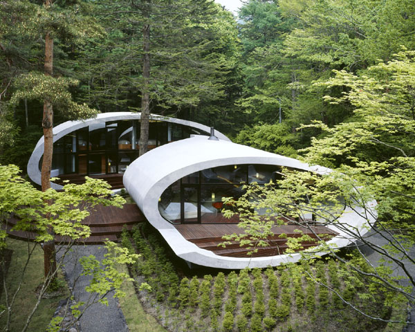
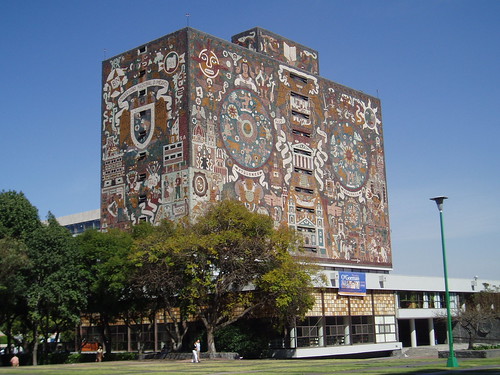
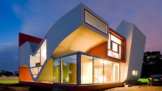
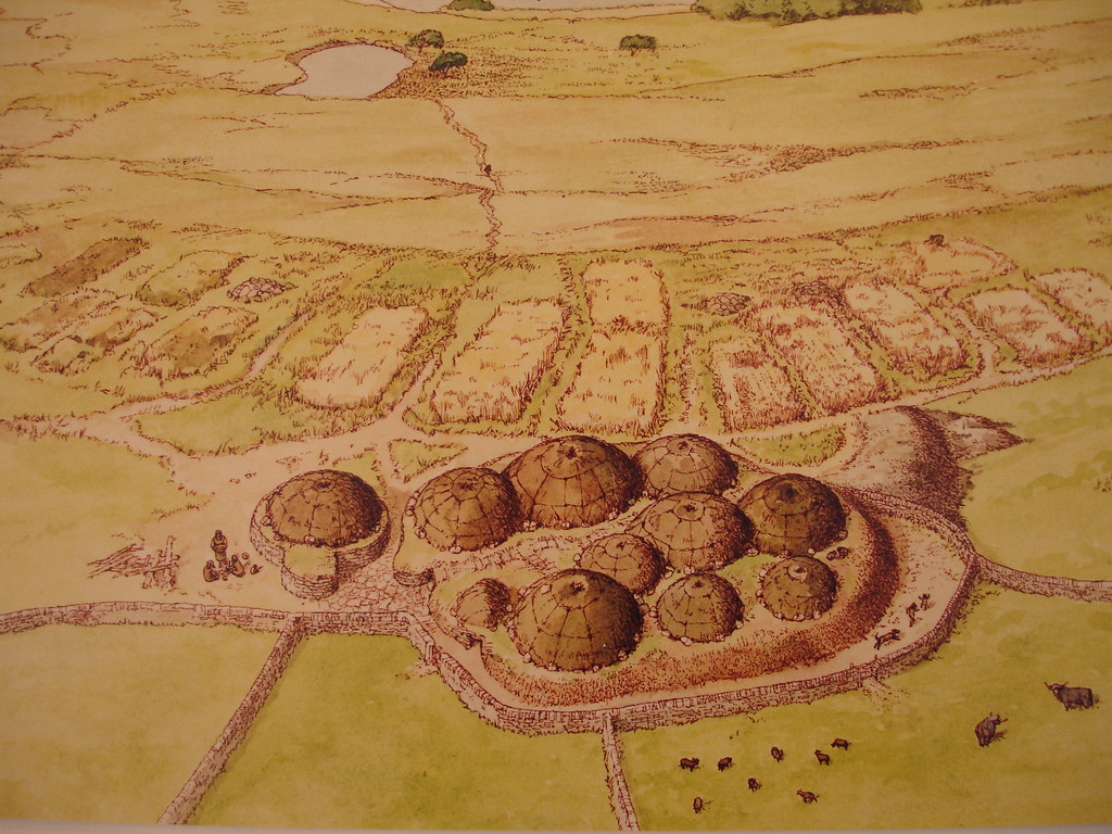
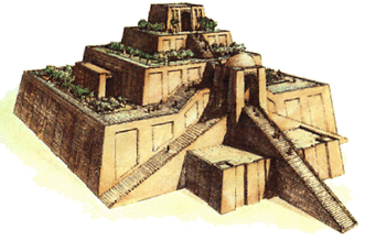
Now the question needs to be asked, why did we desire better aesthetics while the rugged functionality of these stone age housing was still sufficient to live in? What changed? How did we move from this
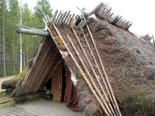
to this?

1. Architecture as an arbiter of human civilization:
I think architecture has much to do with the development of civilization, of order and knowledge. The earliest house dwellers created houses in random patterns, so as to merely survive. These early families were often concentrated in small family groups which take part in a tribe, or a community. Like most modern communities, the architecture is often very similar and are based on the same architectural elements but in different combinations. However, these small family groups are more autonomous in the personal sense, sharing only in the communal food such as kills and plants. This is very reminiscent of the lifestyles of Native Americans, though there is a distinct lack of a leader in the earliest human settlements. Of course, with the cacophony of different people living together in the village, there bounds to be chaos.
Symbol of Civilization? Not Quite.

2. The establishment of law and order
Law and human inhibition is what we claim to be some of the strongest advantages of humanity. Certainly, with these early humans, they still exhibit many primate behavior - notably violence and lack of a control factor which leads to disorder and necessary violence. Shortage of food can be one of the reasons why this happened. Of course, this violence leads to a lot of deaths, which could prompt a wary soul to issue a peace between two opposing parties, thus creating the concept of a de facto leader. This is different from the primitive concept of the alpha male. The alpha male is only concerned with having multiple wives and plenty of access to food and materialistic comfort, while at the expense of other males, does not actually dictate actions and behavior. Therefore, my argument is that differing forms of architecture rose because of the strong human nature to feel superior to others - a desire to have high levels of self esteem. Pride becomes a growing trait amongst humans during this period. For example, the modern Homo Sapiens Sapiens competed with Neanderthals for living space, and won, eliminating the last of the pure Neanderthals from the earth, but with some of their genes still persisting in our blood. So, the man who seized power by leading by example often tends to be pretty strong himself decides he wants to feel important. Assuming he has the family and food he needs, the logical extension of his power would be the dwelling. the house. This inspires innovation from these people, who decide to build him a bigger, better house. Now, of course just simply scaling existing houses isn't going to work because if these are made of stones and wood, they would need to find more stones or longer sticks. This is where these people decided to innovate and produce greater and great structures to honor the men in power. And thus, the main impetus for Architectural change began during this phase.


Buildings of different shapes
Getting there more consistent
More consistent buildings with standard roofs made of different materials. Rectangular buildings are a sign of progress
3. Different Government and Religions create the special need for different types of buildings:
Not only do tribe chieftains were able to have some of the best houses, but the rest of the people do get upgrades too; features such as sanitary systems are put into place because of the need to have a more pleasing environment. This is in direct correlation to the Chieftain's new building and status. If he has the best house and resources, but if his surroundings are filthy and unpleasant, he would not want to live their either. That wasn't the only justification that allowed the ordinary people to gain access to new buildings - these people themselves wanted to incorporate these new styles into the general village. This would soon evolve into the first towns, where buildings are built along a logical grid or layout and then standardized to allow better city planning as people begin to develop complex linguistics and a writing system. This was because there was no concrete form of despotism in early human society - the chieftain has power, but not absolute power, therefore allowing his people to have some leverage in the communities affairs.

Because humans are the fastest growing primates, human tribes eventually come into contact with one another. Not knowing any better, these humans with strong primate instincts would clash with each other - formalizing human warfare because two alpha males can't agree on who's more dominant. So with violence, the most successful alpha males come to establish a kingdom of tribes, united by one man. With the absence of a code of laws, to be able to rule over tribes of people, these kings would employ groups of men as armies, thus stabilizing the population. Of course, with the rise in status and importance these men create grander architecture and then passed down some of these elements to the masses as tribute to his kingdom. Therefore, we have the first Palaces. With the help of his allies was this king able to conquer the territory. To reward his allies, the establishment of a wealthy gentry class create the demand for medium sized extravagant houses. Thus the same styles afforded by the Chieftain, the King expanded into the ranks of the powerful "nobles". The growth of cities accelerated with the presence of a King, which in turn created job classes which was performed by commoners to help run the city. Again, these created new structural styles, because their functions are different. Still, the architecture of this still favored function over artistic design.
This is a little bit advanced but there are a lot of rectangles. Some design elements are represented in this artistic render

Religion was very critical in expanding the scope of primitive human creativity. Stonehenge inspired these humans to arrange huge stones to celebrate the stars and the sun. This expanded the scope of stone and didn't restrict it t to just use for human dwellings. Ancient Pagan religions all associate itself with elements of the Earth - all of them cite some deity of the Sun. This is partially responsible for inspiring these people to create taller buildings, thus introducing the concept of height as a feature of architecture. Even future monotheistic religions employ tall structures in their veneration of their gods. Fur these early religions, height and the placement of objects to mirror solar, lunar and star positions become the guidelines for architecture. These gradually evolve to inspire people to worship them, creating an art form from geometric shapes.
the ascending towards the sky is emphasized by the stairs

Basically, through the first two sections, I theorize where the origins of each element of a building originated from, namely the roof, walls, size, and height as well as consistency and purpose all originated from this era. Still very much an era of function, but the progress of art changes the development paradigm as we get closer to a higher fusion of art and design in architecture.

The Development of Aesthetics I

Why do you think humans evolved to seek "better" looking dwellings when the primitive cave could serve all the functions that a modern house could? How did humans develop the need to produce a separate dwelling away from the caves? I set to put my own theories on how and why this happened.

1. The Origins:
We all can conclude that some of the first housing was caves which gave Paleolithic men its moniker. These caves supported some of the normal functions that we associate with the modern life such as sleeping area and kitchen. To emulate the modern fireplace, Paleolithic people used fireplaces to use as means of keeping themselves warm. These three key elements would strongly define the key characteristic that modern houses are judged by - how many bedrooms, bathroom and living space (recreation) and the kitchen.

2. Migration:
It is also understood that all humans have descended from continental Africa whee the nomadic lifestyle meant depleting several areas of game animals and berry bushes. Now, there are not a lot of caves in Sub-Saharan Africa, but there are trees and plenty of foliage. Not knowing how to react o natural disasters, these humans then find shelter under these trees and then eventually incorporate leaves and stones to create a sense of space. It is also notable that these humanoid primates discovered the need to have a roof over its head. This is essentially the discovery of one of the key elements of a human dwelling; roof. However, the concept of walls is still abstract for these cavemen. It took their nomadic lifestyle to take them into Europe, Asia and North America, where winter during the cold climates taught early humans the importance of Walls; Blizzards, Wind and Snow are just some of the things that require the existence of walls in order to provide a comfortable environment. Thus, the significance of walls was introduced into the human mind. Weather wasn't the only thing encouraging the presence of walls; the dangers of prehistoric animals in Winter made living rather dangerous because these milder climates produce Blizzards and fog which obstruct human vision, therefore decreasing reaction time against animal attacks.

3. Early humans put it all together: the first primitive "artificial" house
All houses not formed by natural means are by strict definition, artificial. Migration plays a very significant role in accomplishing this. These early migrants were not motivated by lure of exploration, instead they migrated further and further because it would allow them to gain access to more animals and berry patches that would allow them to sustain themselves. When these humans reached the corners of Earth, the obvious problem struck them - how do they survive without an abundance of animals to kill? This prompted the eventual development of farming and domestication of certain animals that were easy to kill and breed. Which also meant that these people would have to pursue a more permanent form of living. This would mark the true beginning of architecture, not as an extension of artistic expression, but rather as a form of function. However, certain elements do have to be adopted to make this work. However, the evolution from natural dwellings to artificial ones did not occur instantly; instead it occurred because of the discovery of fire which lead to greatly reducing infant mortality, thus increasing the human population. Even if early nomadic people discovered fire earlier, the need to move frequently often insures that the weak gets left behind. This is also a prominent early example of natural selection and survival of the fittest. Through the curing of meats through fire and the process of natural selection, these people are able to live a bit longer. Initially, these humans settled themselves in earthen houses, with the roofs and walls formed by natural hills and other natural formations. However, these humans were able to create openings and spaces inside these formations and establish a house.

4. Our stereotypical house begins
The rising population meant one thing; it meant that food would have to be stored somewhere and these additional people would also need its own houses. This lead to the development of the first truly artificial houses, using natural materials to fashion a human dwelling. I would imagine these people learned after trial and error not to create a house with a flat roof in wet places. Out of necessity of function, the sloped roof began to take form as the most dominant roof type in human history (thus far). This, as mentioned is purely for functional reasons, not for aesthetics. The wall is where human culture have differed in this early stage - some have circular, some have rectangular and yet some merely extended the reach of the roof to create the first permanent "tent". These are the most basic forms of human architecture, with these houses vary differently by size according to hierarchy and family size. These are also made from easy to gather materials such as straw and rocks, as humans still have not acquired metallic tools. These are the first houses, and the interior does not create interior walls to separate the different functions of the house apart.


Allure of tiny, compact houses II

Cabin Modeled After Fire Tower

This one isn't the smallest, lightest or mobile; instead this one is based on a fire tower base; like a tower or fortress. The inspiration of fire comes from the illuminated second floor which gives this particular house a "fire effect". Despite clad in stone on the bottom, this house is more permanent than any other mobile home (a more substantial foundation would be required), this house still provides a decent amount of sustainability through self sufficient energy through the solar panels. These solar panels provide all of the energy required for general usage. This interior shot is wonderful: the contrast provided by the brown wood invokes Asian motifs but still remains consistently light colored theme. Lighter colors conveys space much better than dark colors can, so the use of lighter colors is a staple of tiny houses.
XS House by Tumbleweed
This is one of the smallest mobile tiny houses available on the market; it is designed to be towed with a truck or a heavy SUV. Featuring a minuscule 65 feet which makes it nearly half the size of my room. This house is designed for a single residence only, as many of its accommodations had to be downsized; toilets and sinks are not comparable to standard sized versions. The bed is lofted onto the top floor, allowing easy access to the resting area. Much like most of tiny houses, the interior design of these houses incorporate very light colors to give an illusion of size and space. However, in this case and with the next one, the addition of the loft bed gives an illusion of size due to the empty gap between the edge of the bed and the opposite of the house. This way it can allow for the other appliances to mesh together on the bottom floor. Overall, this is a very well designed floor plan with all the necessary accommodations for a comfortable living.
 Nine square feet house
This house concept is what tiny houses taken to an extreme; it features a bed, kitchen and bathroom and even porch all rolled into one. While I like the small coziness of this kind of house, I felt that the form factor and lack of open space makes these particular designs. Like the XS House before it, most of these designs incorporate the lofting of the bed on the higher level to preserve the overall size of the portable house. This kind of housing is not a form of permanent housing at all; instead I believe it is merely a glorified tent where a person can just bring their tiny house to a forest so that they can be protected from more elements than a traditional tent would accomplish. Of course, the ability to cook and use bathroom are great advantages. However, while I like this concept of taking tiny houses to its most logical extreme, a car can only pull one of these things and it is a one person only house, therefore making it highly inefficient as a form of portable housing. These designs are just conceptual designs that serves to illustrate the ability of these architects to maximize space, nothing more.


Thursday, September 12, 2013

Allure of tiny, compact houses I

The American culture has always tended to make you believe that bigger is better, as "McMansions" and the general trend of having bigger and bigger houses shows (the average square footage of houses in America has been increasing since the after math of WWII, when Americans started the trend of celebrating the suburban lifestyle by living in neighborhoods like Levittowns.

The Levittown
These houses represent the pinnacle of simplistic architecture; they are modular pieces that are designed for the masses and provide a standard of living which then gradually evolved into the large, diverse suburban houses that has become a staple of the middle class life in present day America. These Levittowns truly ignited the development of suburbs in the 1950s and eventually evolved into the types of houses we use today. These first houses were not designed for large families; instead they provided the accommodations for one core family and a couple of kids. However, the stimulus provided by the next few decades allowed the middle class to truly flourish is very vital in increasing the average size of houses. As these WWII-era couples becoming older, their style of housing changed too; not only do they want larger houses, but they also want more unique houses as well. Levittowns are great for the first post-WWII families, because these families shared the same background and story, but how each of these families lives changed also played a part in how shaping the design of their more permanent housing. Eventually, as more and more Americans entering the ranks of the millionaire, the popularity of McMansions began to soar in popularity with this particular demographic. However, due to the growing significance of Ecology in our Modern society, the trend towards sustainable, small houses has lead to an appreciation of tiny compact houses - some of them are even portable to an extent.
A fitting example of a McMansion
This picture illustrates what the essence of the inside of a tiny house looks like, but take note though this would be for a single person residence. Regardless, these houses combine three aspects of Architectural design; it maximizes usable space in a small area, traditional housing elements and the small ecological footprint of this guy's apartment. I like this concept because it appeals to the people with a solitary attitude and wants independence and some mobility for those who wants a change of scenery and neighbors. I will be evaluating different tiny house in my following posts where I select random tiny houses and analyse them. 

Thursday, August 22, 2013

Futurism: an analysis

As I have stressed previously, I am a proponent of what I dub "futuristic" and modernist architecture because I find them to hold lots of aesthetic appeal - from the stately, clean lines of Modernist Architecture to the free-flowing form of Futuristic architecture, I am a believer in the beauty of these forms of architecture. While, I do appreciate the Classical Architecture, they are anachronistic to our modern aesthetics. What I believe is that when people appreciate good design in gadgets, why don't they also appreciate sleek design in their housing as well? An iPhone or some futuristic flying cars would look surprisingly odd along the old streets of China or Rome, so I feel that architecture should evolve to accommodate the change in design paradigm. As architecture is biggest form of art, it should be free flowing, allowing no restrictions on the incorporation of design elements, rather than sticking to cookie-cutter design of modern houses. While I like the design of contemporary housing, they are not very progressive and are limited to certain design elements that can get boring. So instead, I find modernist houses and futuristic houses to be my favorite form of architecture because if represents progress, form and simplicity. Modernist buildings tends to be mostly made out of squares and rectangles, but makes up for that in the design elements, such as windows, windows blinds, elevation, color and material (such as stone veneer). Futuristic architecture takes the color scheme further and distorts shape to create truly individualized housing. However, the odd thing is, that today's housing provides the best compatibility with furniture from all eras, from ancient busts to futuristic furniture. This is because it keeps up with some of the strengths and weakness of both old and modernist architecture. For example, contemporary housing keeps the basic form of houses intact such as the Victorian house portrayed below. Likewise, it shares the balanced color scheme found in Modernism and incorporate many neutral colors in its interior, allowing for the best of both worlds. On the contrary, if you try and stuff Victorian era furniture into a Modernist house, it will look horrible. Same thing will happen, if you try placing modernist furniture in a Victorian house.
This is Modernist furniture in a contemporary house - looks good and not out of place
Victorian era furniture in a modern house - still doesn't look out of place
Balanced colors and form makes this visually appealing
Unique form and light colors make this a very interesting and attractive house

Saturday, August 17, 2013

Everyday Design Part II

In the previous post, I spoke about the minimalist design that I thought was very effective. Today, I will explore more of this minimalist design that I thought was interesting. It turns out, that there are more of the similar design and I will evaluate how this same design principles applies to different types of food. 

This is the exact same concept applied to two slices of sandwich, but this also pretty effective too; leaving half of the sandwich out certainly helps to keep it in shape as well as provide ingredients information so that those that buy these sandwiches could potentially prevent consuming something the person is allergic too. But even more, the color scheme also matches very well with the sandwich; the brown background and darker font colors (except for green) allow a very clean, professional looking product. This kind of sandwich is something that would be sold at a store in a display or shelf  so that customers could just grab and go. I really like the font, color choices and the sheer symmetry of this sandwich container which combines easy to read ingredients with an attractive presentation.
Again, this is design made simple but excludes a very classic, modernist feel to the design. First of all, these packaging are entirely functional; there are no additions that made it unnecessary. What's more, the name of these ingredients are very clearly labeled and provide a very reasonable color contrast and combination (red with black).  The bottles are given some shape to distinguish itself from other brands and uses high quality parts like glass and a "fat" look to it to increase perception of volume. This is quite simply a masterpiece in minimalist design.
This one, is obviously first and foremost, for kids. That will provide this design as one of the few exceptions to the stricter modernist design criteria; one of which it breaks is any cartoon style drawings which what merits this as a children's design. However, this still employs four colors (beige, white, black and pink) to create a very neutral and clean looking product. Of course, the flap to imitate Batman's hood is an added layer of creativity that sets this from a generic box with a picture of batman on it. On the sides, the short description clearly conveys all the necessary details of the product, so it fulfills its functional purpose. However, it wasn't placed on the front of the box, but I think it should be overlooked because it is indeed a packaging design aimed at children.

In conclusion, these examples show the extension of modernist ideals to everyday items like food which I think allows customers to expect a certain standard when it comes to packaging - not too flashy, give all the details and have pleasant colors and form to allow for the best experience. I truly think these packaging trends really helps and this concludes the mini-series on food.


Thursday, August 15, 2013

Everyday Design Part I

Design doesn't just include technological design, but also includes things like food. Today, I want to share with you guys my thoughts on food packaging design and evaluate it based on its aesthetics and utilitarian value. I will be trying to do this through a random Google image search so that I can be a bit more unbiased in my evaluation of food products.
This one I like - it's apparently a design for a brand of "Zipp smoothie" Like most modern design, this one stays true to the limited color combination (there are only three main colors in any of the three design) which allows this to be a very seamless design. With the emphasis on the lighter variety of these respective colors (the red isn't deep red and the green is a light green) allows for a very "light" feel. Perhaps I find most interesting about this design is the concept of a zipper on the bottle. This has two implications - that drinking this "healthy" product will allow a consumer to reduce his/her weight in such a way that they will be able to zip up a tight-fitting jacket for example. However, I dislike the incredibly small font used by these bottles - they are too small to be entirely practical. Even still, the giant fruits does still give some indication of what the contents are like. Otherwise, the bottle, is well a bottle and it serves its function just fine. The design is mostly good, but only because of the concept. Otherwise, any other design are merely forced abstract portrayal of the product information. In short, sticking a triangle and writing on it "smoothie" is convenient, but not very aesthetically different. In a world full of competition, this is not a good thing.
As opposed the previous one, this one is extremely effective at conveying what is inside the bottle; preferring to utilize the color of its contents to provide the background of the sides of the container. These are the perfect example of utilitarian design which allows important information such as ingredients to be displayed on the front side of the product. This is good, as it condenses two important consumer information when it comes down to food (what is it and what is it made of) The colors also help deliver stylistic differentiation but still maintaining the three color rule to provide for a pleasant experience (the yellow font on the lemonade on the left is an example of color choice) 

In short, these two images display widely different approaches to design. I would like to call the first style as an artistic interpretation of design - the incorporation of symbolic ideas to create a concept to market. The second one I would like to think of as an very utilitarian response to design, pursuing function over design, but adding design principles to make it appealing to the consumer. I think both of these forms excel at the same thing, but in different ways.

Designed by Apple in California Video Analysis


Earlier in my previous post, I examined the kind of designs that I enjoyed where I talked about consumer design and I mentioned the iPad mini as one of those design that I felt quite encapsulates the trends for the early 21st century. But not only that, I would like to extrapolate this by examining how this relates to Apple's Design thought. To do this, I will refer to the infamous Designed by Apple in California video which explains many of Apple's design theory and how it relates to the iPad mini. But it doesn't just reflect on Apple's design, it is also reflected upon it marketing philosophy.


The video overall has this very simple black and white theme which is immediately reflected with the design of all of Apple's products except for the iPod line and older macs. In fact, Apple's own website is largely gray and white, with hints of black. This is not just a common theme for Apple products, but is is also a common color combination for modernist design in general; a three/two color complimentary combination often allows for a clear, non cluttered layout. The message of the video speaks to design as invoking emotions with consumers. This phenomenon is true with color, shape and construction having the biggest impact on creating joy for consumers with an Apple product. The colors - black and white is a very classy combination and the white version of Apple products are often coveted because they give this immaculate, delicate appearance to it. Knowing that its products are often monochromatic, Apple's marketing and design involves two other important elements that makes Apple very successful. Their ads and info pages often depict people smiling while using their products and at the same time using very colorful themes within the iOS operating system itself, allowing Apple to emphasize the actual user experience, rather than the product design. Apple is also popularizes the simple market method; using concise buzz words like "Retina" and bold claims like "the World's most advanced mobile operating system" to give consumers the low down on their products. This often allows Apple to captivate its consumers quickly and allow them to spread the word more quickly. Apple's video also maintained that "for a thousand no, there is one yes" as a fancy way of saying that there were many drafts and revisions before there was even a prototype. This doesn't make Apple any way unique; like its marketing buzz words, this is another example of Apple's stylistic marketing. Looking into the future of Apple, their iOS 7 operating system emphasizes the bright user experience and simplistic approach into design, reinforcing Apple's design ethos of hardware as being "sleek" and user experience "productive and colorful". However, I will review iOS 7 in the future and give a more in depth look at the creation of Apple Vice Design Chief, Jony Ive.

Friday, August 9, 2013

Personal Interest in Design Part III: Types of Design I Like

This is a continuation of my previous post which articulates the different kinds of design I like. In this post, I will focus on Consumer electronics design, which has always been a strong field for design, as consumers in the present day where good design can sell. In this post, I will showcase different products and I will attempt to articulate why I like these designs.

1. iPad Mini
I personally find the iPad mini much more attractive than the standard 10 inch iPad. For instance, this iPad comes with very little bezel around its screen and it comes with a beautiful aluminum unibody chassis. This comes together in a very attractive and slim package that will function very well as an ultra portable tablet. However, I must point out the several practical flaws of the iPad mini. First of all, the aluminum chassis makes the iPad mini extremely slippery; holding it doesn't feel secure - it does not provide enough of a grip especially as the tablet uses an unconventional 4:3 aspect ratio, giving a slight disadvantage to people with smaller hands. Speaking of the 4:3 ratio, oftentimes movies and media files in widescreen format oftentimes induce black bars on the iPad, thus eliminating some of the benefits of utilizing the extra screen estate. Even still, the iPad mini is fulfills its intended purpose just fine and offers great aesthetics on top of it. These two key elements work to create a "good" design.

The iPad mini and Apple products in general encapsulate many of the modern aesthetic sense; simple, clean and monochromatic colors help establish elegance and functionality. To this end, Apple is often considered as one of the tech industry's best designers, having started this trend towards what I coin "beautiful simplicity".

2. Corsair Vengeance K70 & K95 mechanical keyboard
These keyboards represents a good fusion between design and functionality. First, from an functional perspective, these are also some of the better keyboards on the market. These keyboards are mechanical keyboards which mean they utilize actual physical switches to register key presses rather than using electrical impulses to transmit this information. This has two huge advantages; first of all, these keyboards doesn't require a-lot of actuation force in order to register key presses. These keyboards utilize the Cherry MX Red switches, which means they require low actuation force but have less tacile feedback. Even so, typing on these keyboards feel far more satisfying than membrane style keyboards because of the satisfying experience of bottoming out on these keyboards - I can feel some of the key presses on these keyboards due to this. Another advantage is the sheer lifespan of these keyboards; these keyboards are rated up to 50 million key presses, while membrane keyboards typically offer 15 million key presses before they wear out. Being mechanical, the keys on this keyboard are taller than membrane keyboards are. So, the company (Corsair) designed this keyboard to expose the area underneath this keyboard to allow for two things; to allow for easy cleaning after removing key-caps and the unique aesthetic back light created by the exposed keys. Combing this with a solid brushed aluminum and soft touch wrist rest, these keyboard provide an extremely premium typing experience. This is what I consider to be an ideal fusion of function and aesthetics.

3. The Nvidia Geforce GTX 690/780/Titan
The pixels we see on our computer monitors are driven by GPUs, which utilizes a parallel computing architecture to process a series of images and displays them to our screen. The biggest GPU manufacturer, Nvidia produced three graphics cards geared for the Desktop PC Gaming/Professional crowd. These cards are the highest performing consumer cards on the market right now, and their design is simply one of the most amazing I've ever witnessed in a consumer graphics card. These cards have both function and design, though there is more design than function in play here. These cards are made of premium materials, featuring aluminum and poly carbonate coatings and laser etchings to provide a very classy look. The led with bright Geforce GTX etched onto the top, it is clear to gamers and professionals whose brand this is and which class of computing power these have. Very much like the two products before it, there is a great emphasis on white/gray as the color of choice because it represents something immaculate and pristine, giving it a touch of class.
4. Rhombus vs Rectangles
This isn't really a tech product, but more of the issue of shape. None other describes free-flowing design more than The upcoming PlayStation 4 and the Xbox One gaming consoles. I am personally heavily favored towards the PlayStation 4 design because of the edgy look of the console; it doesn't have the boring rectangle box of the Xbox One and it is offered in a slightly shorter (but longer) profile than the Xbox One. Not only that, but the Slot loading Blu Ray Drive and USB 3.0 ports on the PlayStation 4 are hidden from sight without it's two wedges, to not obstruct too much from the frontal facade. Likewise, the vents on the back is an example of intelligent integration, giving the PS4 a much streamlined look than the Xbox One, which has air vents across the top and bottom of the console. But, mostly, nothing says bad design like an old fashioned "Rectangular DVR". However, to Microsoft's credit, the device does utilize a modernist black theme with angular air vents to distinguish itself a bit further. It also scores extra points for having a very consistent design with the Kinect sensor included with the console. To some extent, the Xbox One keeps general design principles, but the rectangular shape of the console is not original.
Clever Air vents provides unique aesthetic and functional design
Rhombus design

Rectangular Design
Those Air vents are all over the place and a USB port on the side

Thursday, August 8, 2013

Personal Interest in Design Part II: Types of Design I Like

I talked about my origins in design in the earlier post, but I didn't talk about what kinds of design I am interested in. My interest in design ranges from many different things, from architecture to consumer devices to video game design. These are the main fields of interest in design I take an interest in.

Architecture: 
I personally enjoy modernist architecture because it offers great color contrast and abstract design. I am a big fan of the "futuristic" nature of these architecture. Houses like Falling-water by Frank Lloyd Wright serves as prime examples of this design - formalist cubes formed around an waterfall. Not only, that the building have beige with red accents to provide a sharp contrast between form and texture. Typically, my taste in color is also reflected by modernist architecture; I am a strong proponent of one, two and up to three colors in an design. In other words, I have a strong distaste for rainbow colors in Architecture because it detracts from the form of the structure. For example, the World Cup Stadium in Johannesburg, South Africa is a prominent example why I do not like colorful buildings. These colors are like colors that don't take themselves seriously, therefore why I do like them. However, of course, if the purpose of the building is to provide childcare, for example, then I do not have any problems with adding more than three colors. Architecture is much like Android Design (again) in that I believe it should first be functional, then stylistic. But my personal difference with Architecture versus Mobile App Design is Architecture must also achieve higher forms and aesthetic value. My personal philosophy is that if you are going to erect a giant building, then why not put effort into making it a very welcome place to be? If people simply decide to build everything based on rectangles and brick, then the world would be a very boring place to be. But architecture is also an reflection of personal and cultural values. Therefore the form is to be protected and promoted because it is an extension of people and their cultural values. Without style, how does the French or the Romans construct triumph arches? An arch made out of brick holds no significance, but the commemorative arches do provide cultural significance.
Too much red and yellow

Another bad example of color (Mexico City Library) - it may portray Aztec culture but from a design perspective, this building fails because of its color and a very boring form

Saturday, August 3, 2013

Personal Interest in Design Part I: The Foundations

I would like to begin by stating the origins of my interest in architecture and design. You see, the first career that crossed my mind was Art. When I first immigrated to the United States at the age of six, my aspiration was to become an artist; the aspect of freedom captivated my interests. However, because of my youth, I did not commit long to drawing lessons. My passion for aesthetics remained, but my actual commitment waned. However, much later, I divulged in Windows designing, using Java to design the windows used in the Windows operating system in the form of SWT. This was actually my first foray into formal design.
This was a very informal intro into design - I learned what different buttons and parts of a windows worked together to form a coherent functional window. Groups and Tabs taught me virtual management while the logical progression of important programs such as Task Manager in Windows. While dabbling in Windows visual design, I felt that it was a very natural thing for me to do - everything fitted together with a very logical framework as I seamlessly learned the various ways to design a window.

Fast forward several years into my high school career where my dad persuaded me into doing taking the introductory Drafting I in High School. This class served as another gateway in my journey with design. While I was opposed at first to taking a "boring class", I later come to appreciate the value of such a skill. In Drafting I class, I learned to handle blueprints and design things using AutoCAD software.
This class had two profound effects on me; first of all it piqued my interest in the Art and Design field and second of all it introduced me to 3D visualization and precision design. The ability to visualize 3D objects and map them out on a 2D interface also introduced the aspect of prospective to me. With another year of formal architecture class, I was initially set on making Architecture my future career. However, the practicality of being an Architect forced me to reconsider my options. Now, though I strive to deal with Design in general and be able to be versatile with many different facets of design.

Thursday, August 1, 2013

Art vs Design and Color

The distinction between Art and Design is often times confusing for the casual observer; I strive to make this distinction in this blog post - in this post I will articulate the difference between Art and Design. In laymen's term, Art is an unrestricted expression of an individual, while Design doesn't have that freedom; it is bound by purpose and criticism. While it is possible to profit from self expression; it will have a limited audience because only those that share the artists vision will purchase the requisite artwork. While I'm not discrediting artistic expression; I find sense and purpose in design and with that, I will provide my own thoughts on the key differences between Art and Design.

Good Art Inspires; Design innovates.
Competition is what drives Design innovation; you want to be more competitive with your design, so you come up with better, more efficient design. Case in point: Jony Ive of Apple's design for the Apple Mobile Operating System, iOS 7 is very much Apple's interpretation of Microsoft's "Flat" Windows 8 UI.

Art is about re-inventing the wheel; sometimes Design is about incorporating the best elements that can maximize functionality. This is also a call back to the previous Android Design post about making consistent themes for Android so that it can be a seamless transition from home screen to app. 

Good Art is interpreted; Good Design is understood.
If a Design is flashy, but not functional, it does not withstand the criteria of good design; a unique artwork is subject to personal opinions on whether it is "good" or not. Good Design is understood through it's usage and application. If it produces desired results, then the Design will be categorized as "Good".

Good Art is a Talent; Good Design is a Skill
Art requires higher level of hand-eye coordination than Design; but a good Designer needs to have a high level of visualization so that it can plan out the Design ahead of time. To me, Art is the gradual perfection towards higher levels of brain hand synthesis; in that is indicates a high level of discipline and dedication. Design also requires commitment, but it is a more of Creativity and technical knowledge to succeed.

Good Art sends different messages; Good Design gives the same messages to everyone
As stated earlier, Art is subject heavily to personal interpretation, but Good Design will be structured in such a way that everyone should be able to have the same experience; it should ideally allow everyone to produce the same results (as in application design). However, as with art, things like Color and shapes will still play a role in determining individual responses to different styles.

In retrospect to all I said, I am an advocate of Artistic Design which is the pure fusion of Art and Design which is to achieve two clear goals; provide usability and functionality with an attention to the aesthetics.