Iconography is popularly associated with things like Egyptian hieroglyphs, Illuminati logos, the eye on the top of the pyramid at the back of all the one dollar bills. I do not wish to delve into the secret and supposed conspiracy theories behind these arcane inscriptions, but rather the aesthetics of iconography through the modern period and it's relation to modern design.
Icons as described can mean an religious figure of ardent devotion, it can also be used to denote important figures or it can mean a symbolic representation of some concept. In context of modern design, icons is a superset of logos and other representative symbolism. Specifically, I want to focus on the modern relation of logos to ancient iconography.
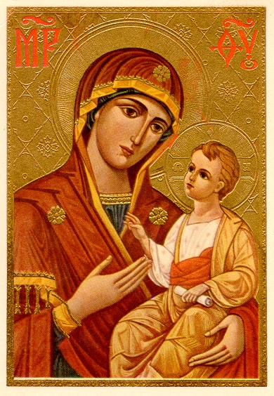
Before the conception of corporations, existed different entities of worship. The earliest known usage of icons in the English language existed for figures of divine descent. These icons were represented in altar form as a means of representation of it's brand. A woman with a baby with halos behind them was the signature of Mary and baby Jesus. This was a colloquial representation, a form popularly known across Christian Europe. Compared to Roman Denarii, with their portraits of Roman emperors, those were known as a relief, a representation of the emperor's likeness. It wasn't called an icon, it wasn't created to proliferate knowledge of the current emperor; word of mouth already conveyed that information. Icons are representative of not just some figure or concept, it was integral to the spirituality of nascent Christianity.

The term icon in relation to important people or landmark events wasn't termed explicitly, but rather interchangeably. After the desolation of idol worship, the term icon came to represent more secular concepts in the English lexicography. Phrases like iconic inventions or an icon of the Gilded Age was used more frequently. Perhaps because the proliferation of railroads decreased communication latency, the successful have reached a from of cult status from their contribution to the Industrial Revolution. The Industrial Revolution is often remembered by history in relation to their icons - the notable individuals and events that shape the brand of the Industrial Revolution. Because the Industrial Revolution would so heavily impact politics and economics in the coming century, these innovators and their inventions have garnered worldwide relevance. The light bulb, the steam engine are all hallmarks, or icons of the Industrial Revolution. Thomas Edison, James Watt are similarly considered icons of their age.
There is an argument to be made for those that preceded the Industrial Age. To modern observers, Leonardo Da Vinci is admired and hailed as an icon of art and engineering. This is because we have more sophisticated intercommunications that allow us to all objectively espouse Da Vinci's legacy. While it's true that those in the West during the Industrial Revolution might share the same sentiment, the still limited communications and cultural interactions between these countries prevent Da Vinci from being an icon in Industrial Europe. The lack of cultural interactions is attributed to the rising ideology of nationalism. It is only today, with the eyes of the whole world, do people universally applaud Da Vinci's work and immortalize him through the widespread admiration of the Mona Lisa.
Therefore, the existence of icons being applied to important people or events is purely a matter of modern perspective. It does mean that the people in the 19th century necessarily agree with modern citizens.
 |
| The icon of Leonardo Da Vinci |
The shift in nomenclature appellation of icons to scientists and inventors shifted during the meteoric rise of Elvis Presley, who ushered in the liberation of music through saucy gyrations. His upbeat music set him as an icon of the fifties, albeit one of the entertainment industry. Despite being part of the entertainment industry, the fifties was the period of youthful expression, spearheaded by Elvis. He became the face of not only the music, but also the changing political atmosphere of the baby boom generation.
 |
| iconic figure and social icon of the fifties |
It was during this period that saw many of the modern juggernauts of the modern age. Wal-Mart, McDonalds saw it's origins in the 1940s. Along with the new economic boom saw a need for brand recognition. McDonald's original logo signaled a new epoch in the meaning of icons. Gradually, icons became cornerstones of a business, becoming the front-line in brand recognition. Quaker Oats, for example also saw an increased role in solidifying their Quaker by simplifying their mascot from a random, 18th century political cartoon style character to the friendly Quaker that we come to recognize with the Quaker name. This period saw an increased use and importance in the creation of icons.
| Original McDonald's logo |
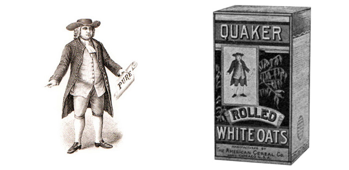 |
| Original Quaker Oats logo |
It was soon clear in the new market dynamics, virtually every business would need an icon to represent themselves. Apple's logo went through many revisions because they realize that an icon by itself can convey a huge amount of information to consumers. Or, it was when IBM shifted towards it's famous stripped letters logo so that people can identify with IBM quality. While our history books refer to the past successes as "icons", we synonymously associate icons with both historical icons and corporate/individual icons.
The advent of the Internet Age witnessed increased abstraction in logos, particularly in the are of virtual logos. While past logos may involve a certain degree of skeumorphism or less saturated colors or even an anthropopathic mascot. Overall, the logo design today tend to be more balanced in terms of color, less complex, but more formless in an attempt to stay original. The twitter, Facebook, Google, instagram, etc. logos are all symbolic of their respective companies, but very iconic. They are icons of the internet age. The Facebook like icon follows their blue and white color schemes. This stands in contrast to the colorful cacophony of the second Apple logo or even the boring black and white overtones of the original Apple logo or original Sherwin Williams ones. Design for websites and digital contents have less apt to be artistic and detailed, because people's attention span aren't draw to black and white pictures. This is also in direct proportion to number of skilled digital artists and advancements in other form of design. The Post-modernist Architecture movement also required the evolution of logos in order to synthesize an aesthetically pleasing environment. These include a deconstruction of traditional building elements to throwing together traditional shapes into a work of streamlined design. These same concepts carried over to design, where icons was made to attract customers and make it recognizable. Icons by today's time have received such prominent emphasis that sometimes people make purchasing decision based solely on brand recognition.
| Original logo is black and white |
 |
| Also in black and white. This is Sherwin William's first logo. |
No comments:
Post a Comment